Revora



A website and brand for a modern gym: a logo, an electric purple and lime identity, and one page from the first headline to the membership plans.
- Year
- 2024
- Role
- Design + development
- Stack
- HTML
- CSS
- JavaScript
- Illustrator
- Website
- revora-lac.vercel.app ↗
The brief
Revora is a personal project: the brand and the website for a modern gym, with trainers, equipment and flexible memberships. It had to feel like energy and still answer the plain questions: what can I train, who will coach me, what does it cost.
The work is the identity, a logo, colors and type, and the page that puts them to use. The trainers, reviews and prices are sample content, and there is nothing to book behind them.
The outcome
A one-page site live on Vercel: a headline and a photo, the programs, the products, the trainers, three membership plans, a contact form and the questions people ask before they join. A menu that works with a keyboard, and rows that swipe on a phone.
Behind it is a complete identity: a logo as a full name and as a mark, an electric purple and lime palette, and two typefaces.
A gym that looks as strong as it trains.
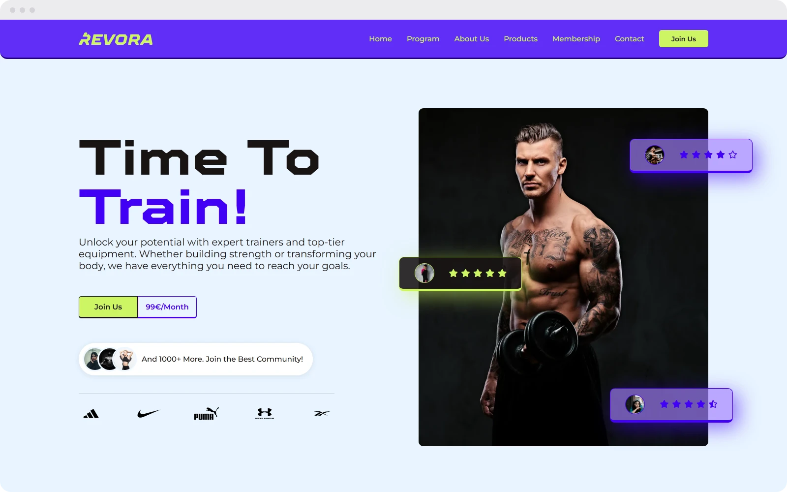
Time To Train!
The first screen says what the gym is for in four words, and the lime button under it is the one thing to press. Next to it, a trainer's photo with rating chips floating over it shows who the gym is for. A row of sports brands and three numbers, a thousand members, five hundred classes a week and open 24/7, come before anything has to be explained.
headline, then one button
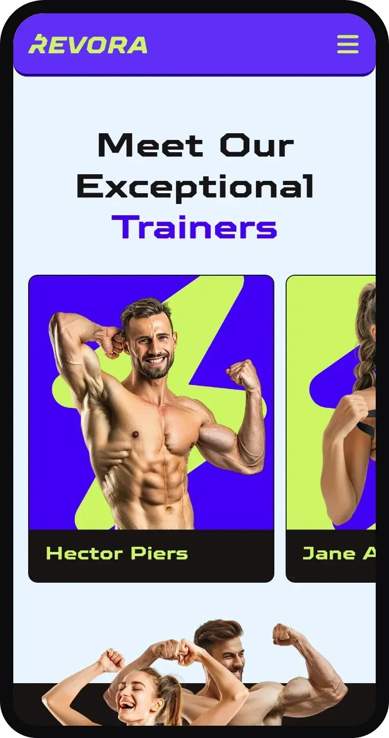
Programs and trainers you can swipe
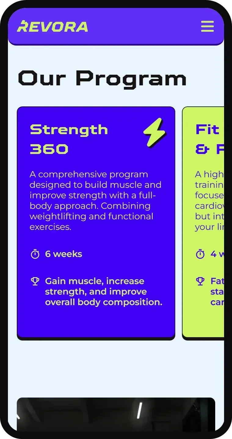
Each of the four programs is one card: its name, how long it runs, what it is for, and a bolt in the corner. Lime and purple alternate, so the row has a rhythm, and the trainers get the same cards with a photo on top.
On a phone both turn into rows that snap from card to card, with the next one always peeking in from the side.
one card, one goal
Electric purple, lime and a bolt
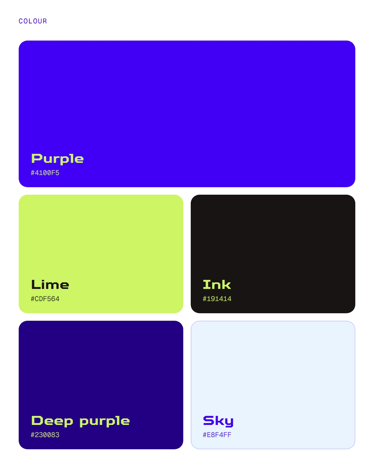
Purple is the brand and lime is the action: every button, price and highlight. Ink holds the text and the dark cards, and a pale sky blue is the page they sit on.
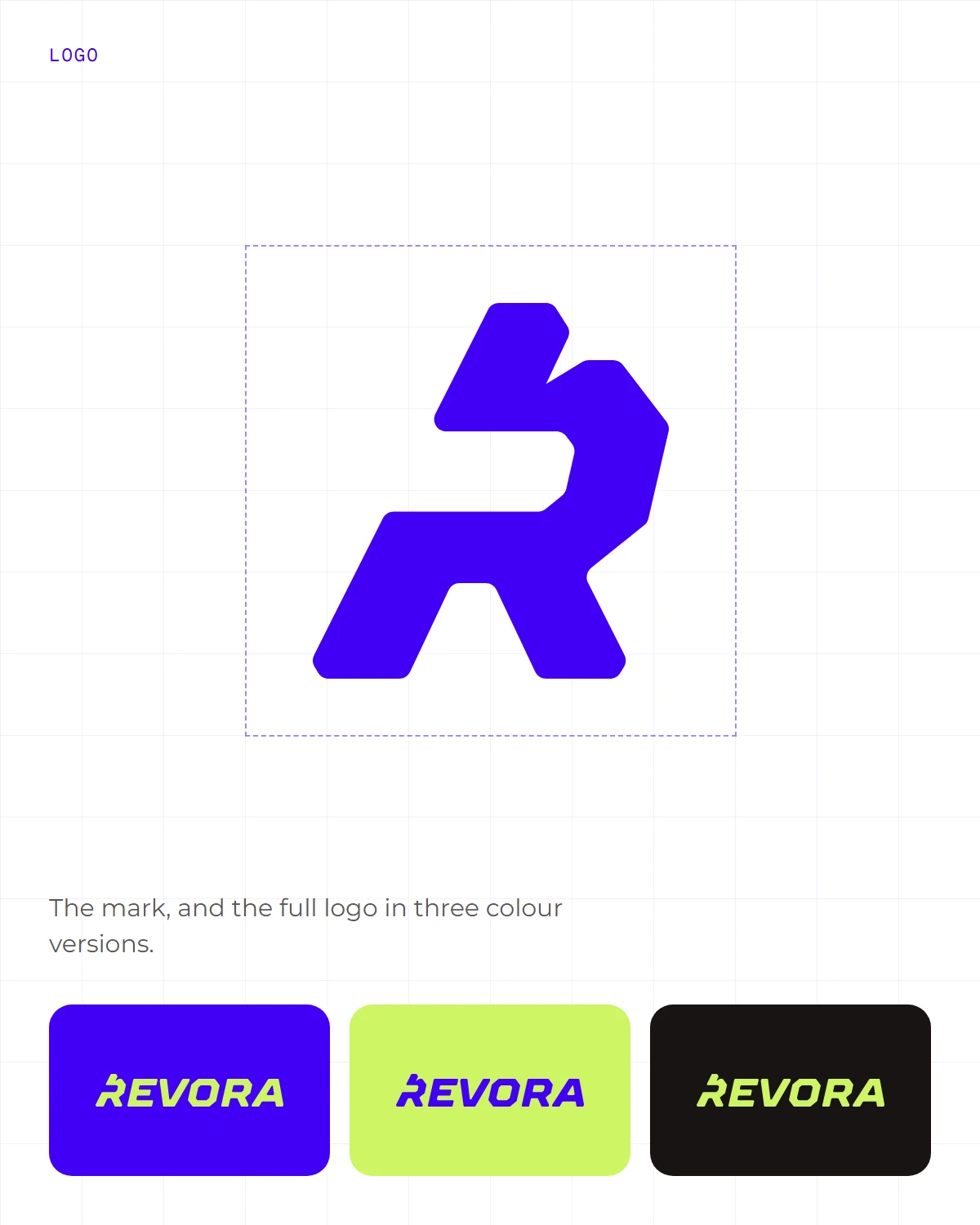
The logo is the name in heavy, slanted, squared-off letters, with the R also working as the mark on its own. A lightning bolt marks each program card and sits behind every trainer. Headings and numbers are set in TT Octosquares, text and buttons in Montserrat.

Built around the thumb
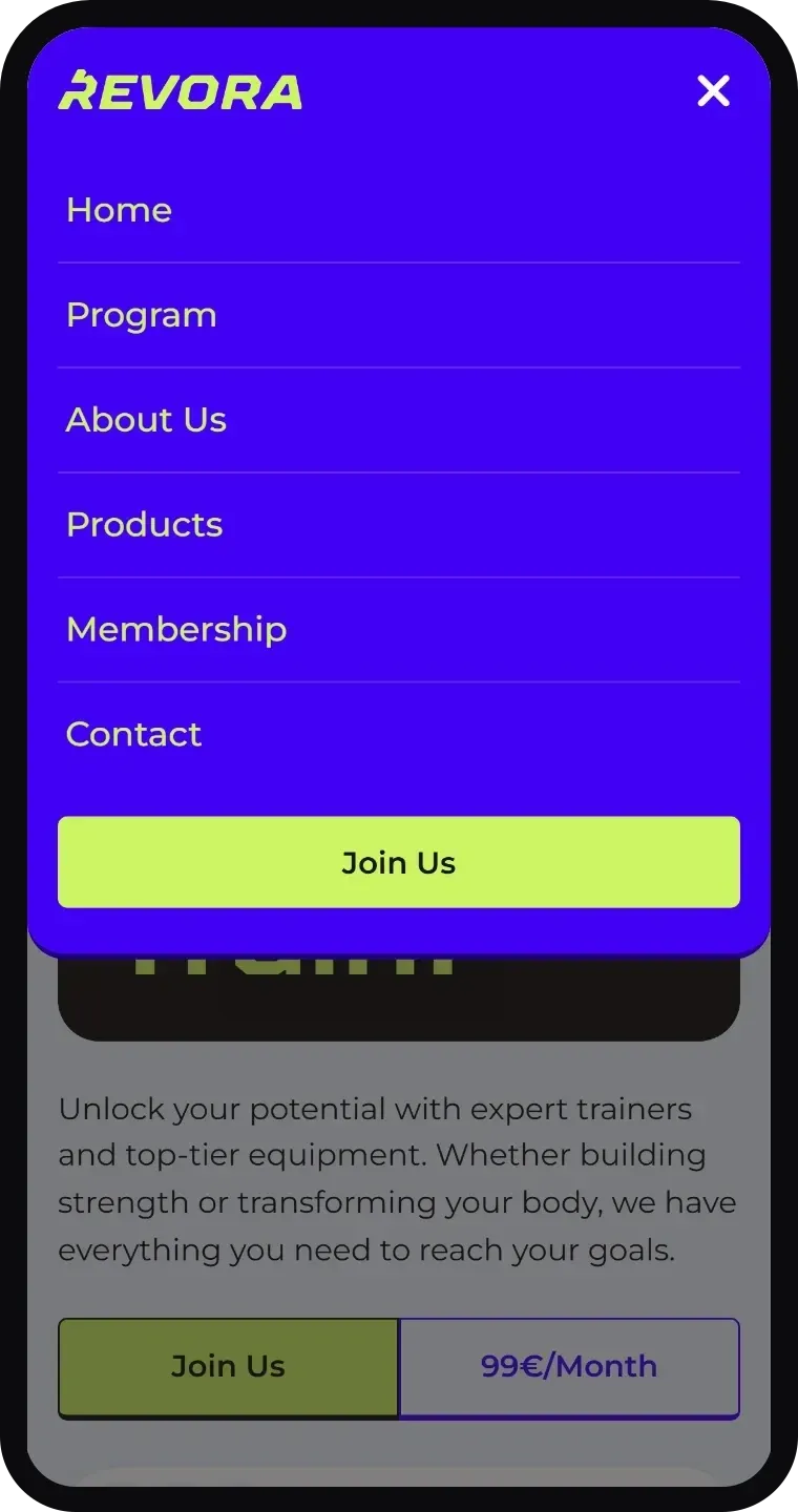
On a phone the menu drops from the bar as one panel: every link and the Join Us button sit inside the thumb's reach, and it closes again with a tap on a link or the Escape key.
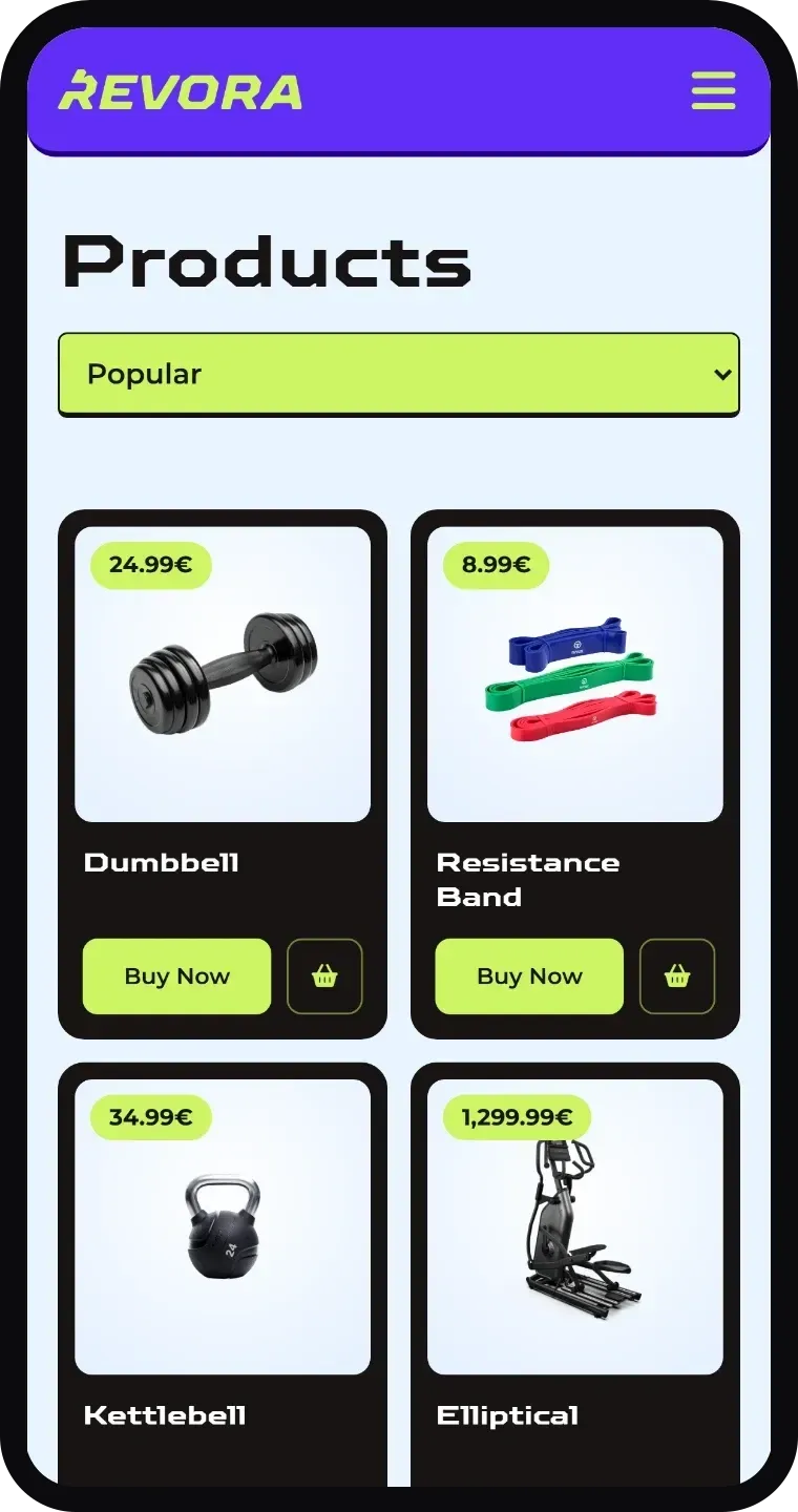
The products sit two across, each with a Buy Now button as wide as its card, so the price and the button always share a screen.
big buttons, short reach
Three plans, one stands out
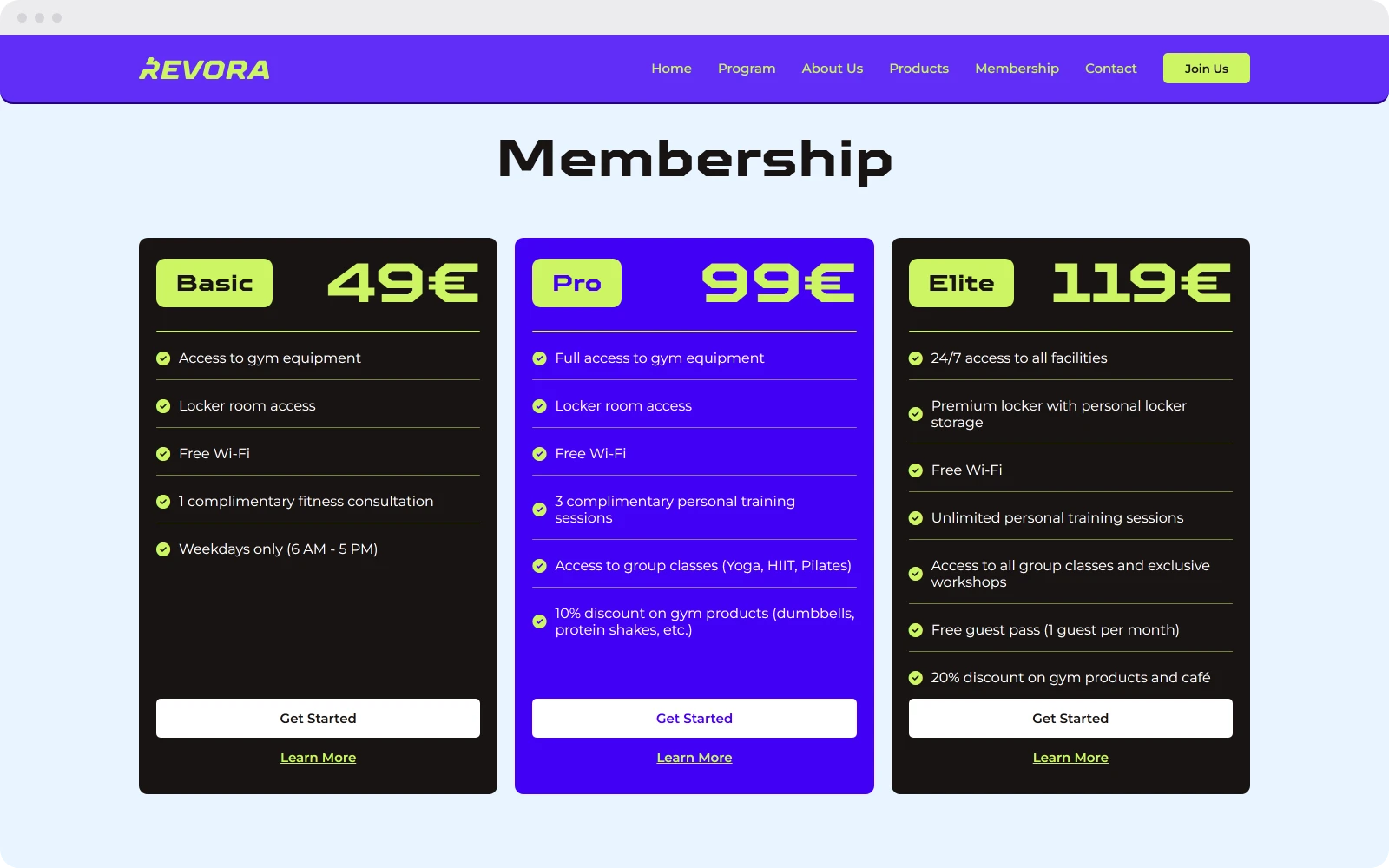
Basic, Pro and Elite cost 49, 99 and 119 euros. The middle plan is the only purple card, and it is the one that adds personal training and group classes, so it is the one the eye lands on first.
Each plan lists what it includes with a lime check mark, and the same white Get Started button closes all three.