Learnify



An online learning platform for web development, graphic design and UI/UX: a course catalogue, a page for every course, and accounts.
- Year
- 2024
- Role
- Design + development
- Stack
- React
- React Router
- Vite
- Illustrator
The brief
Learnify is a personal project: a learning platform for three fields, web development, graphic design and UI/UX, where the courses themselves are the front page.
It needed a catalogue you can browse and search, a page for every course, and the pages to sign up, log in and get in touch. The courses, prices and reviews are sample content, and there is nothing to buy or watch behind them: the work is the design and the front end.
The outcome
A complete front end in React with eight pages, from the home page to the course pages, log in and sign up, live on Vercel. Navigation happens in the browser with React Router, so moving between pages doesn't reload the site.
The twenty-eight courses, the testimonials and the team all come from data files, so the content can grow without touching the layout.
Finding the right course should take one search, not ten clicks.
Twenty-eight courses, one source
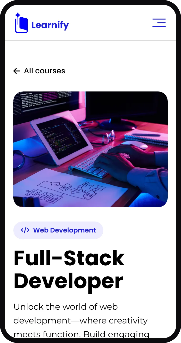
Every course is one entry in a single list: its title, photo, length, rating, students, price and categories. The home page rows, the category sections, the filters and each course's own page all read from it.
A course's address comes from its name, like /courses/full-stack-developer, and its page shows more courses from the same field underneath.
one entry, its own page
Search that always answers
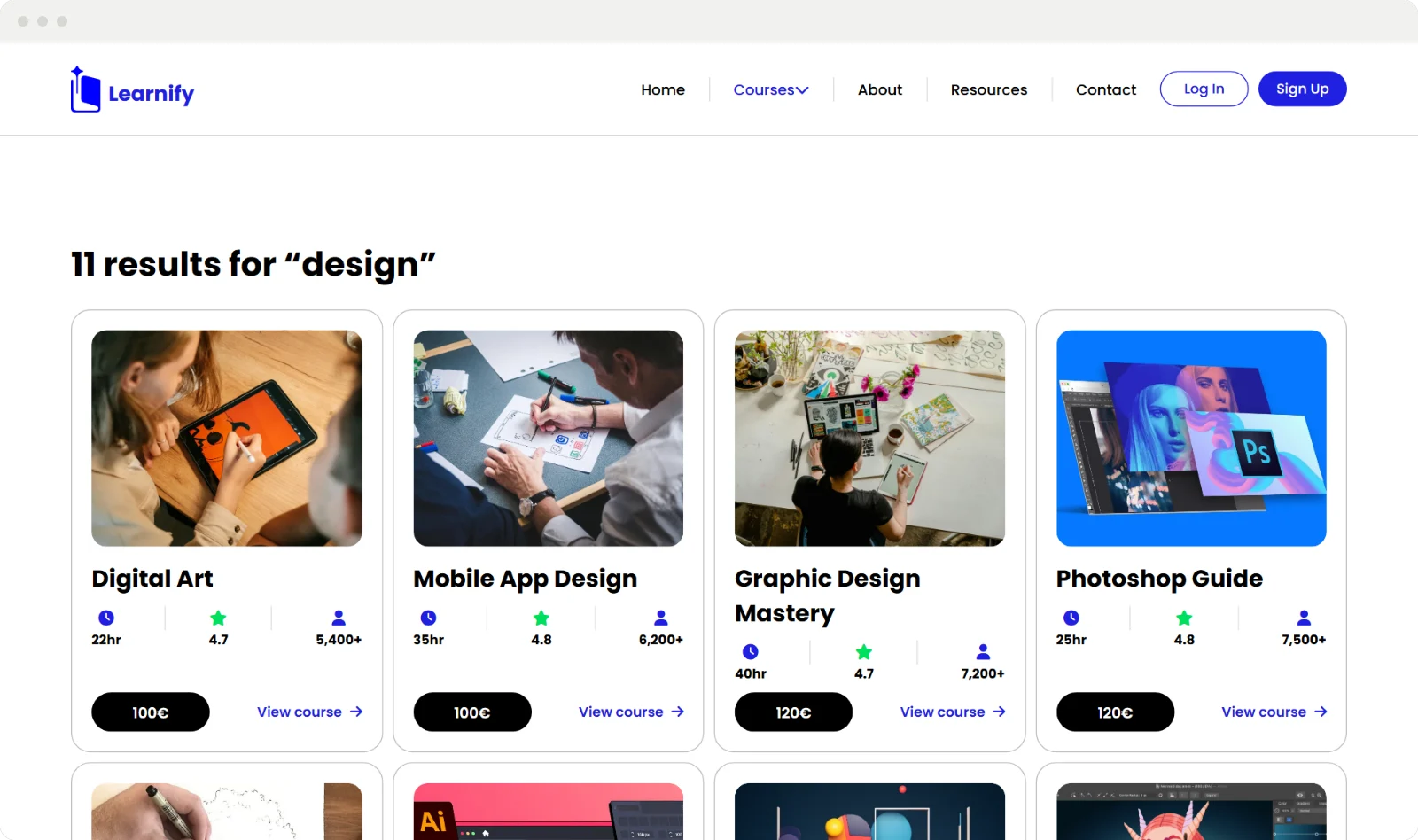
The search on the courses page looks through every title and category as you type, and says how many courses it found; the one on the home page takes you there with your words already in it. When nothing matches, it suggests a few words to try instead of leaving an empty page.
type "design", get eleven
More than a course list
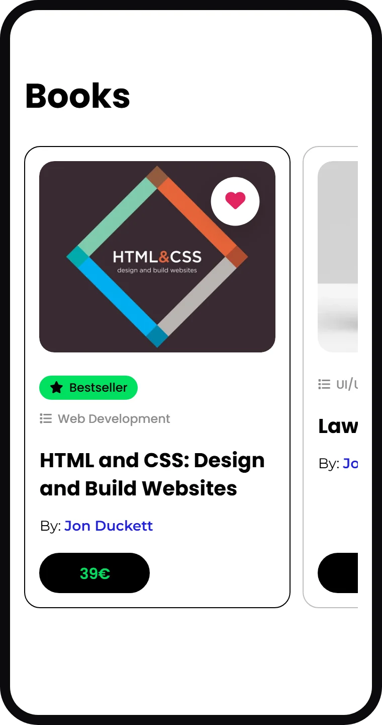
The Resources page is what you read between lessons: a featured story that changes in a slideshow, a blog tagged by field, student projects, and a shelf of books on design and code.
Each book shows its field, its author and its price, and a heart marks the ones you like. On a phone the shelf turns into one row you swipe through.
a heart for the good ones
Electric blue, green and a star
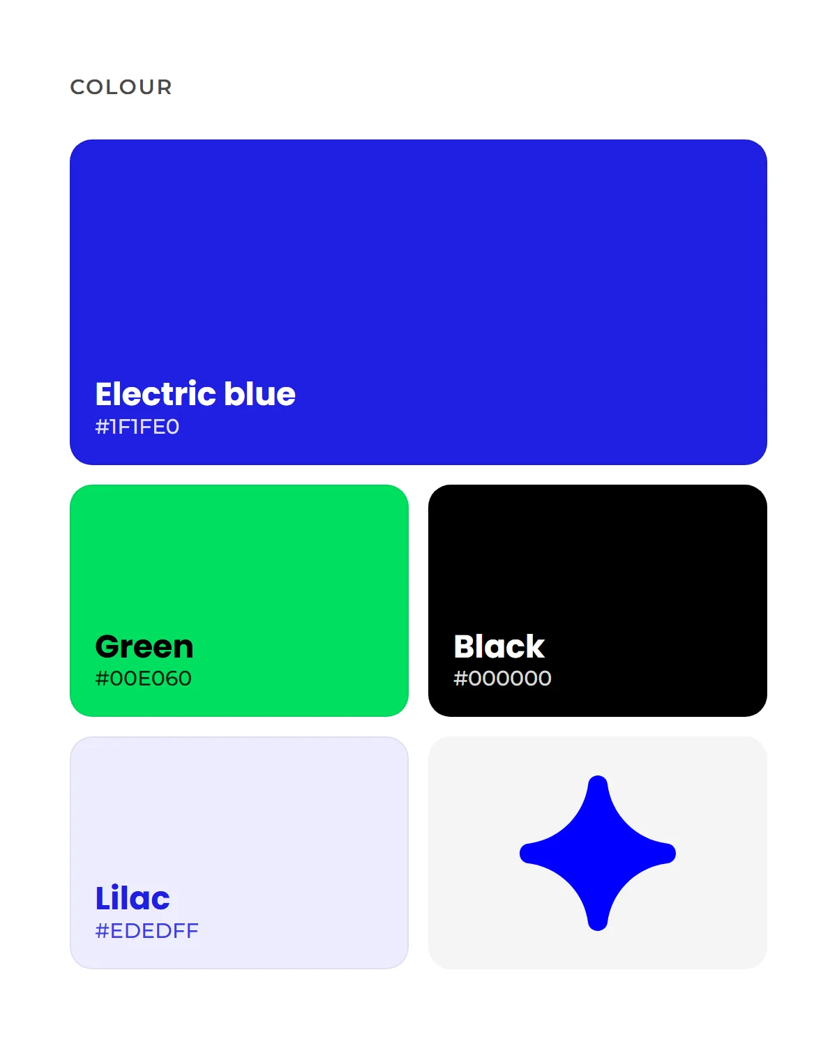
Electric blue is the brand: the logo, the main buttons and the footer. Green is the second action and the highlights, black holds the category cards, and a four-pointed star comes back as the one decorative shape.
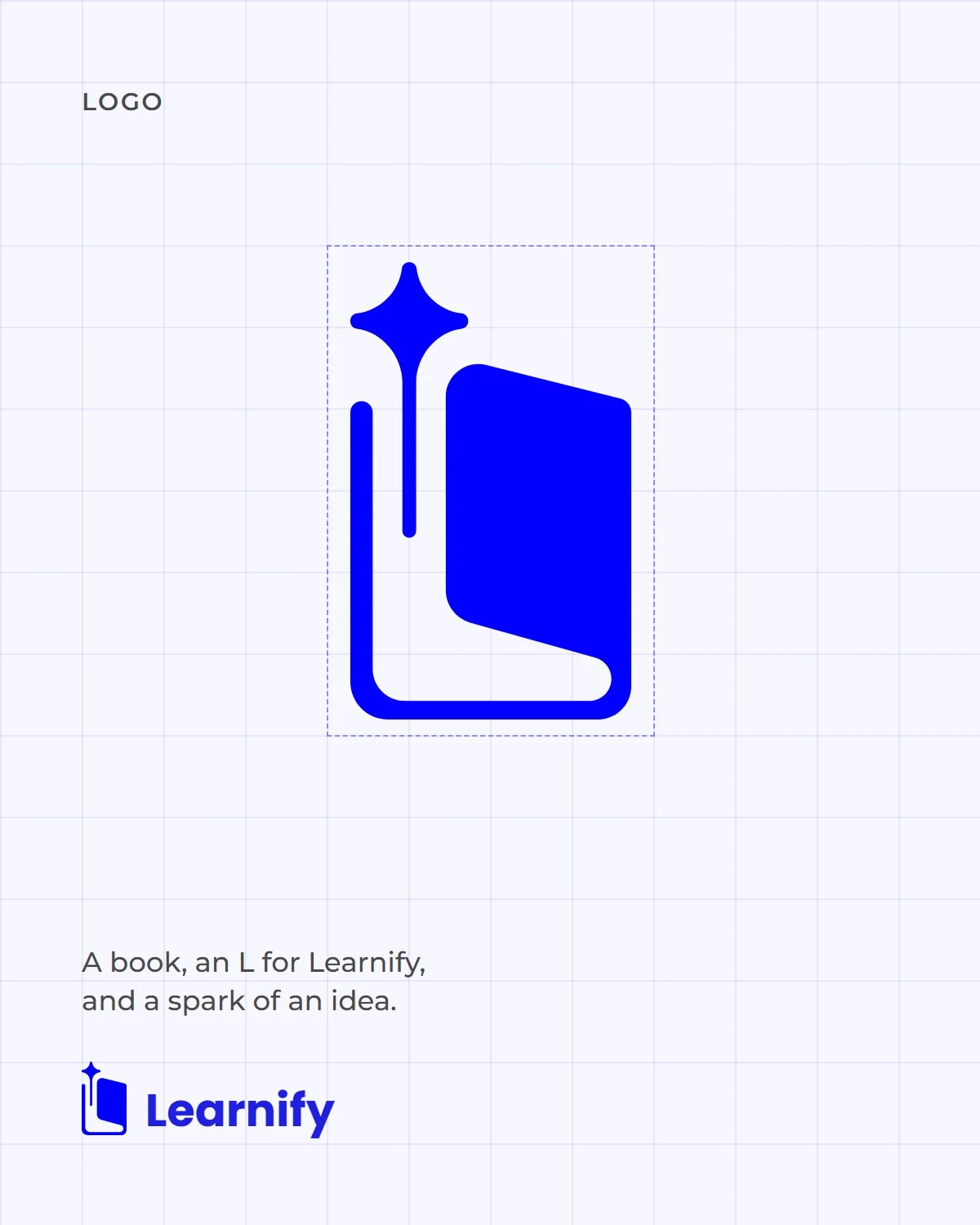
The mark is a book with a spark rising beside its spine, set next to the name in Poppins Bold. Headings and buttons are set in Poppins too, the text in Montserrat.

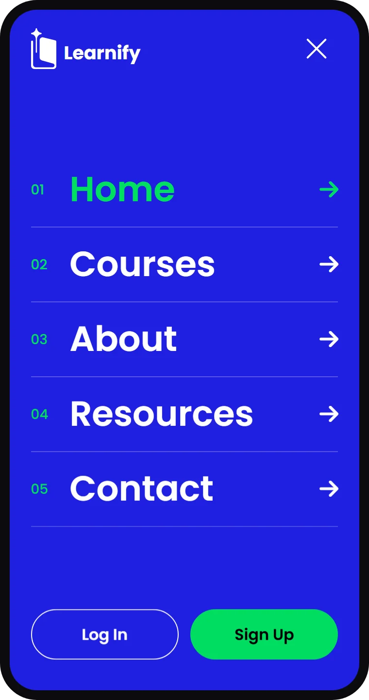
A menu within reach of a thumb
On a phone the menu takes the whole screen in the brand's blue, with numbered links large enough to tap without aiming. Log in and sign up sit at the bottom, where a thumb already is.