Prizreni Plus
A brand identity for a local bakery in Prizren: a logo that puts the town's Stone Bridge, a loaf of bread and wheat in one mark, with the colors, type and packaging to go with it.
- Year
- 2024
- Role
- Brand identity
- Stack
- Illustrator
- Photoshop
The brief
Prizreni Plus is a local bakery in Prizren, in Kosovo. It needed an identity that feels like the town it sits in and the food it makes: modern in its shape, with something old inside it.
The work is the whole visual identity: the logo and its versions, the colors, the type, and how they look on what a bakery hands over the counter.
The outcome
A complete identity: a logo as a badge, as a horizontal lockup and as the mark alone, a three-color palette, two typefaces, and the identity shown on aprons, bread bags, wrapping paper, cups, pins, keyrings, a business card and a hanging shop sign.
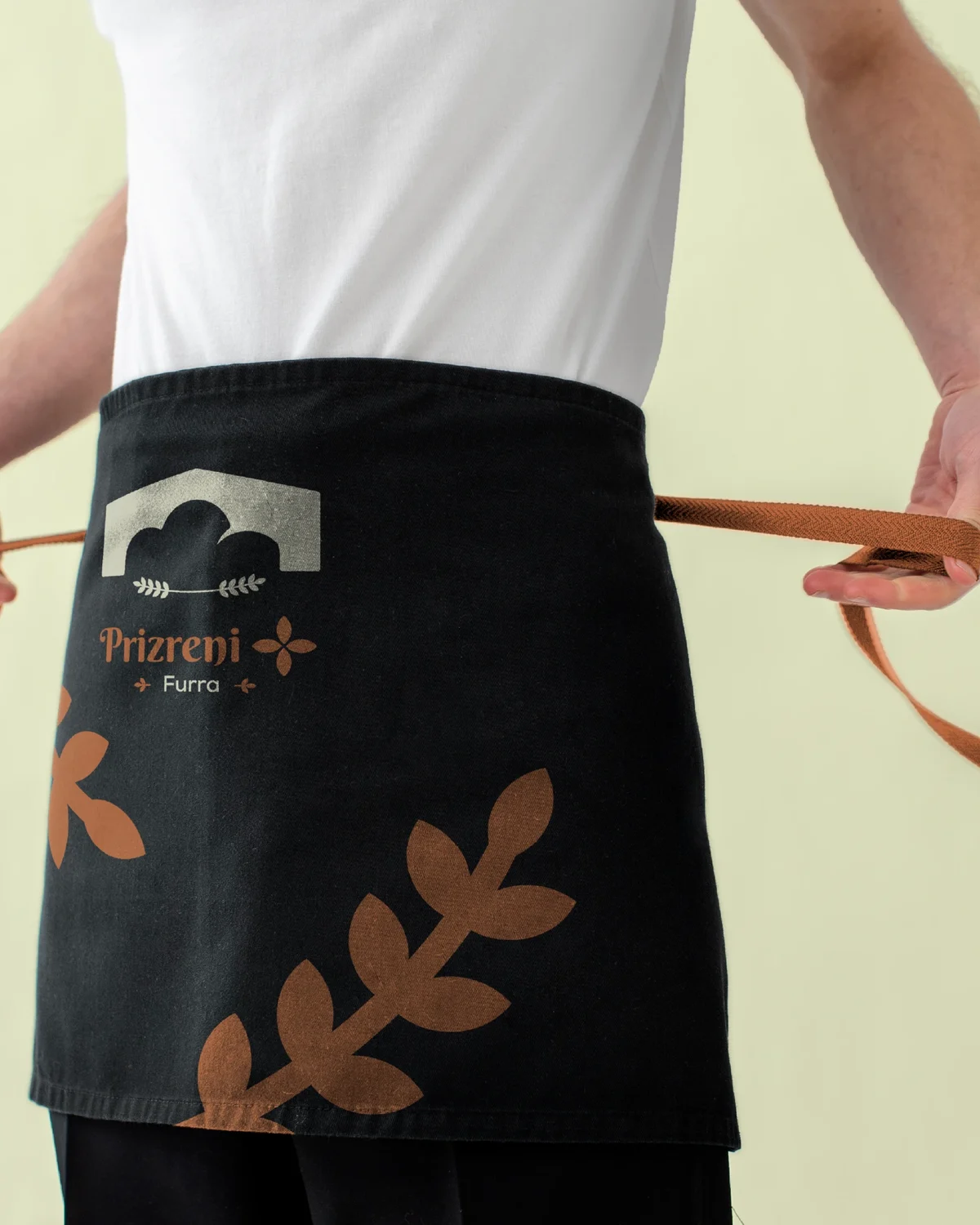
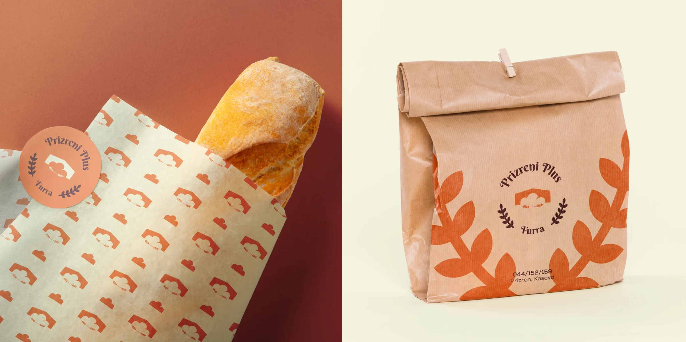
Everything starts from one mark, so the badge, the pattern on the paper and the wheat climbing the apron all read as the same bakery.
A Prizren bakery with the Stone Bridge on its sign.
Bread, a bridge and wheat in one mark
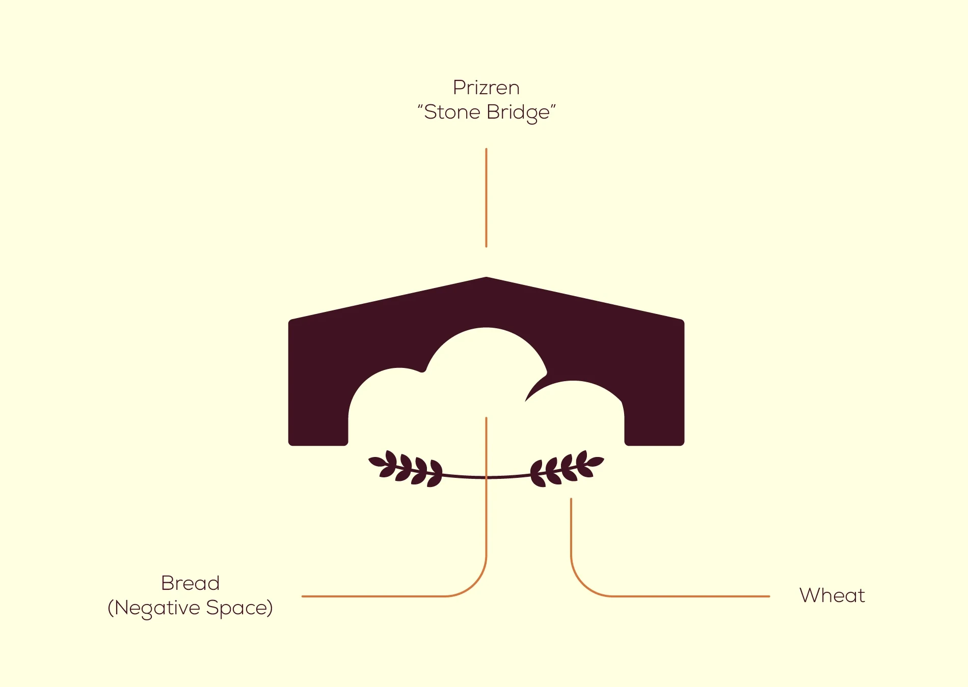
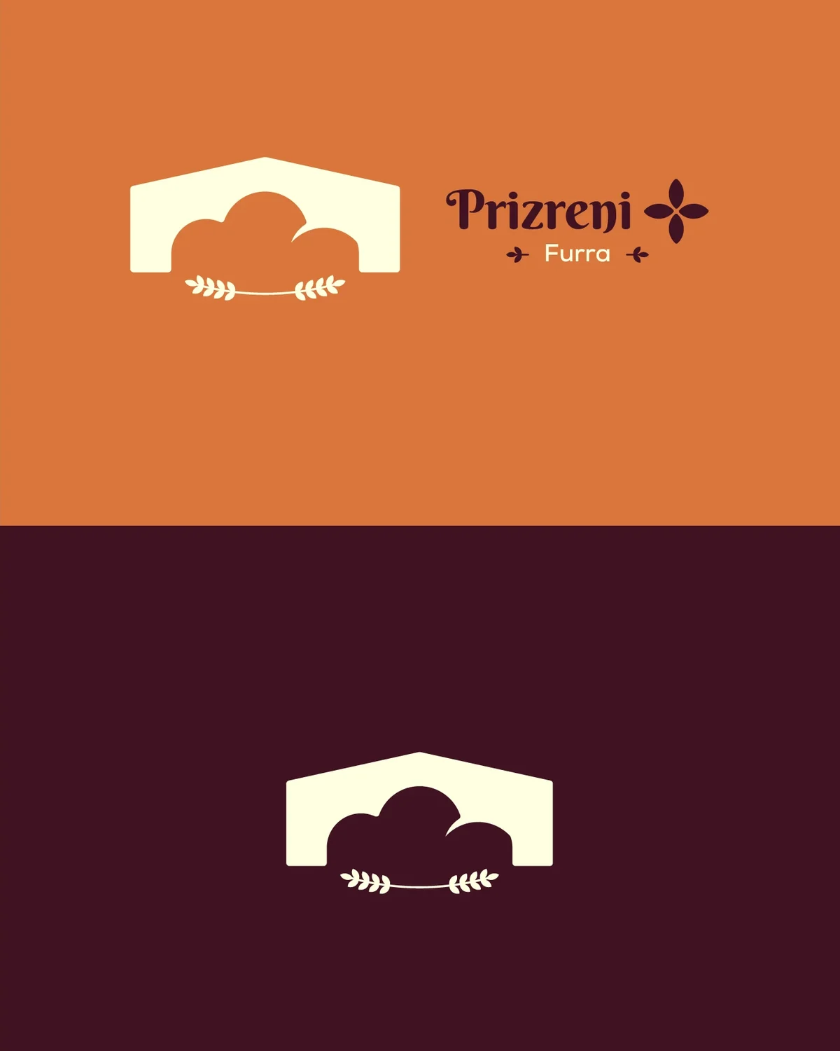
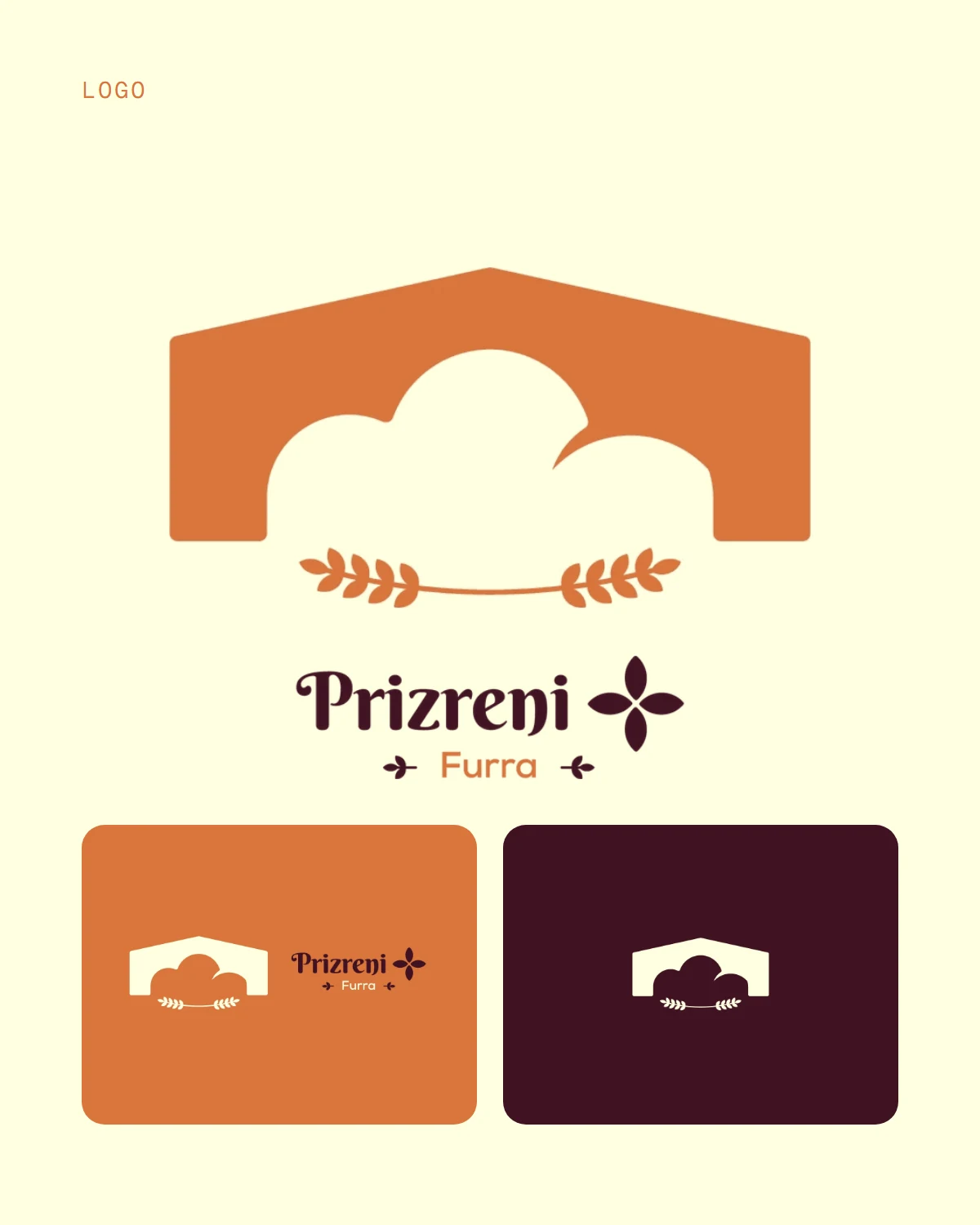
The mark is built from three things. The arch is the Stone Bridge, the best-known sight in Prizren. The loaf of bread is the space under that arch: it isn't drawn, it's what the bridge leaves open. Two sprigs of wheat tie it together at the bottom.
The result is modern and flat, a single solid shape, with a very old landmark inside it.
the bread is the gap under the arch
One mark, three ways to wear it
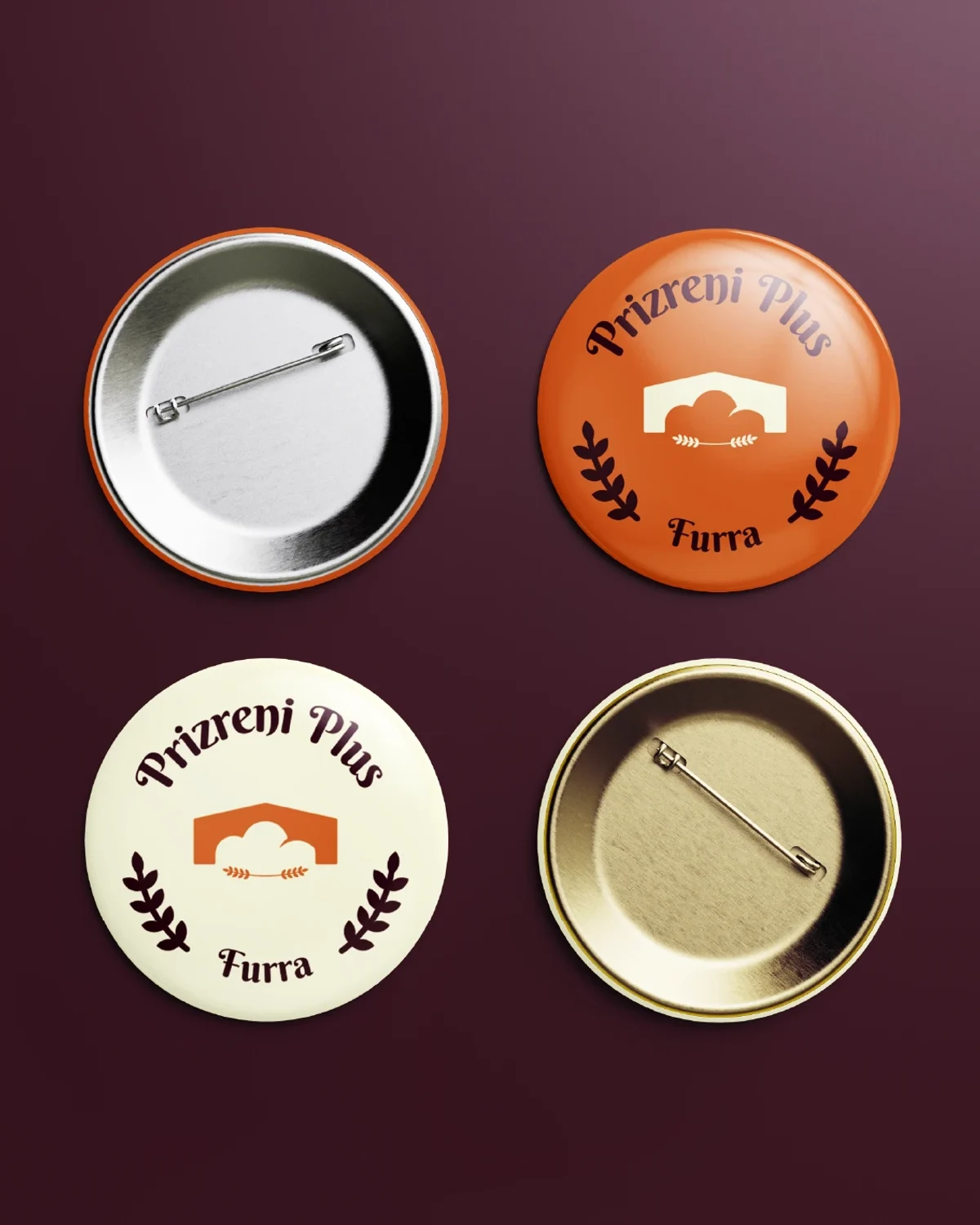
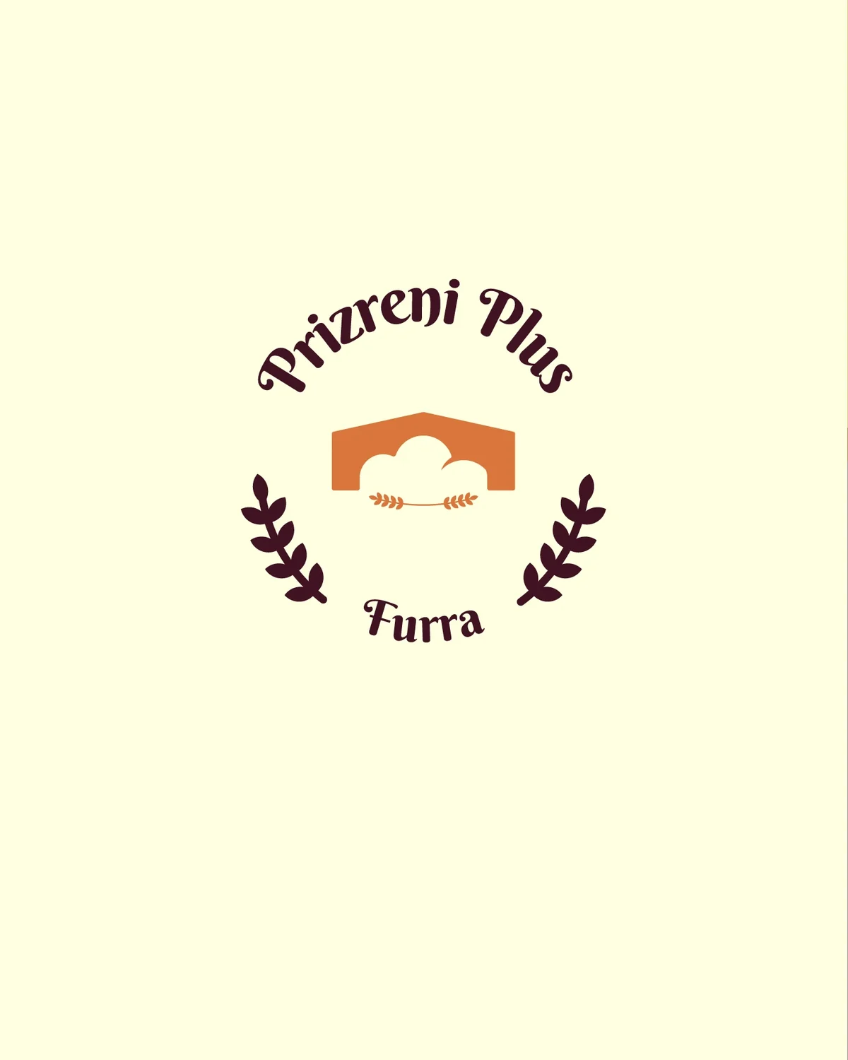
The mark comes in three forms for three kinds of space. The badge sets the name on a curve between two branches, with Furra, the Albanian word for oven, underneath. It fits anything round: a cup, a pin, a sticker, a sign.
For anything wide, the bridge sits beside the name with a four-petal flower, and on solid orange or plum the mark works on its own.
round things get the badge
Warm orange, deep plum and a swash serif
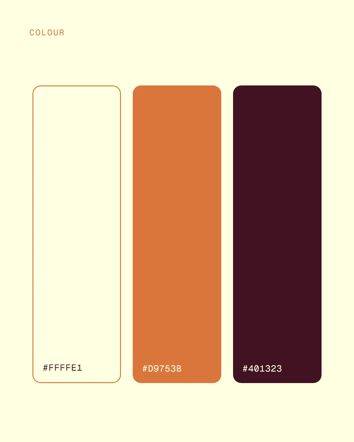
The palette is three colors: a cream for paper, an orange the color of a baked crust, and a plum dark enough to read as chocolate. Cream and plum carry the text and the quiet surfaces, and the orange is the one that stands out.
Headings and the name are set in Berkshire Swash, a serif with curling capitals that looks hand-lettered. The text is in Nexa, a plain geometric sans that stays easy to read at small sizes.

A wheat branch up the apron and the bread bag
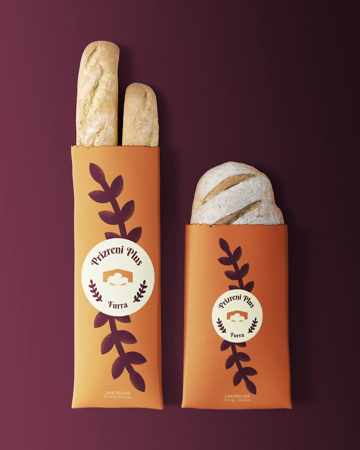
A single large branch of wheat climbs the apron and runs down the bread bags, in the brand's own orange and plum. The logo stays small, as a stamp on the apron and a seal on the bag, and the branch does the talking.
the logo stays small, the wheat is big
Paper that looks like the shop
The wrapping paper repeats the mark as a pattern, and the paper bag carries the badge with a bold sprig of wheat. The bread leaves the shop already wearing the brand.
Small things people take home
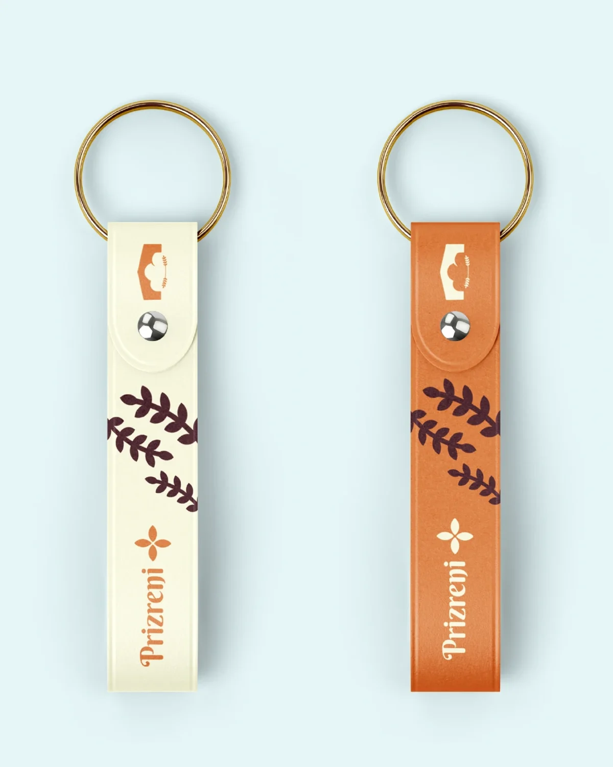
The badge works as well at the size of a button as on a sign. A cup, a pin and a keyring each carry it, so the brand follows the customer out of the door and keeps showing up after the bread is gone.
one badge, from sign to keyring