Solence
A brand identity for a glamping site in the mountains: a tent, a mountain and the sun drawn as one mark, with the colors, type and the things guests touch.
- Year
- 2025
- Role
- Brand identity
- Stack
- Illustrator
- Photoshop
The brief
Solence is a glamping site in the mountains: tents in a pine forest, with a view of the peaks. It needed an identity as calm as the place, that a guest would recognise on a sign at the end of a mountain road and on the things they use while they stay.
The work is the whole visual identity: the mark and the logo, the colors, the type, and how they look on the site's own things.
The outcome
A complete identity: a mark built on a construction grid, with its clear space; vertical and horizontal logos and versions for dark grounds; a four-color palette taken from the landscape; one typeface in its full range of weights; and the identity across the site, from the entrance sign and the wayfinding to the tents, the staff, the business cards and the welcome card on the bed.
Everything comes from one mark, so even on a mug by the fire it still reads as the same place.
A tent, a mountain and the sun in one mark.
Three things the guests come for
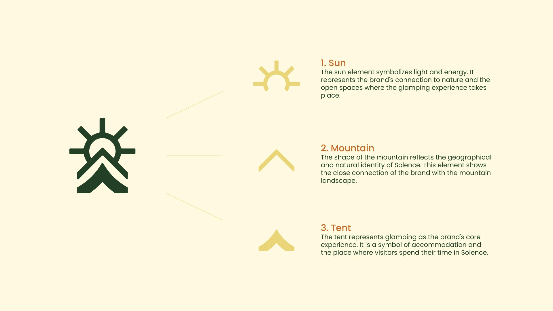
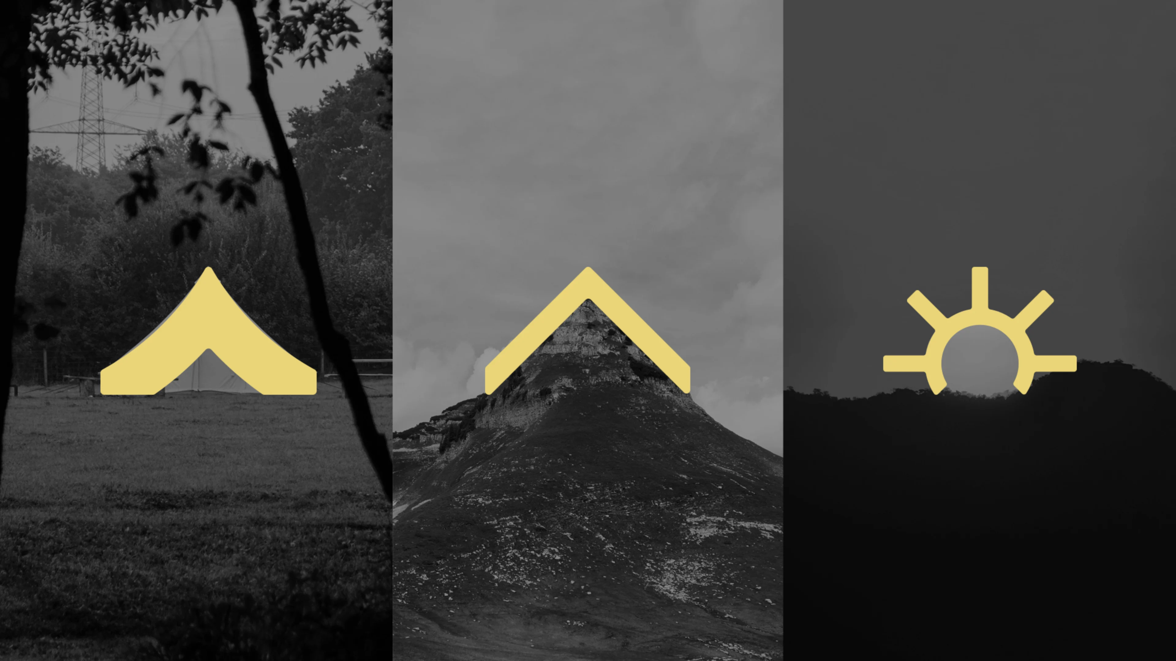
The mark puts together the three things that make the place. The sun is the light and the open air. The mountain is where it is. The tent is the stay itself, the reason people come.
Each one is a simple shape on its own. Stacked, they make a mark that reads as a sun rising over a peak, with the tent at its base.
sun, mountain, tent
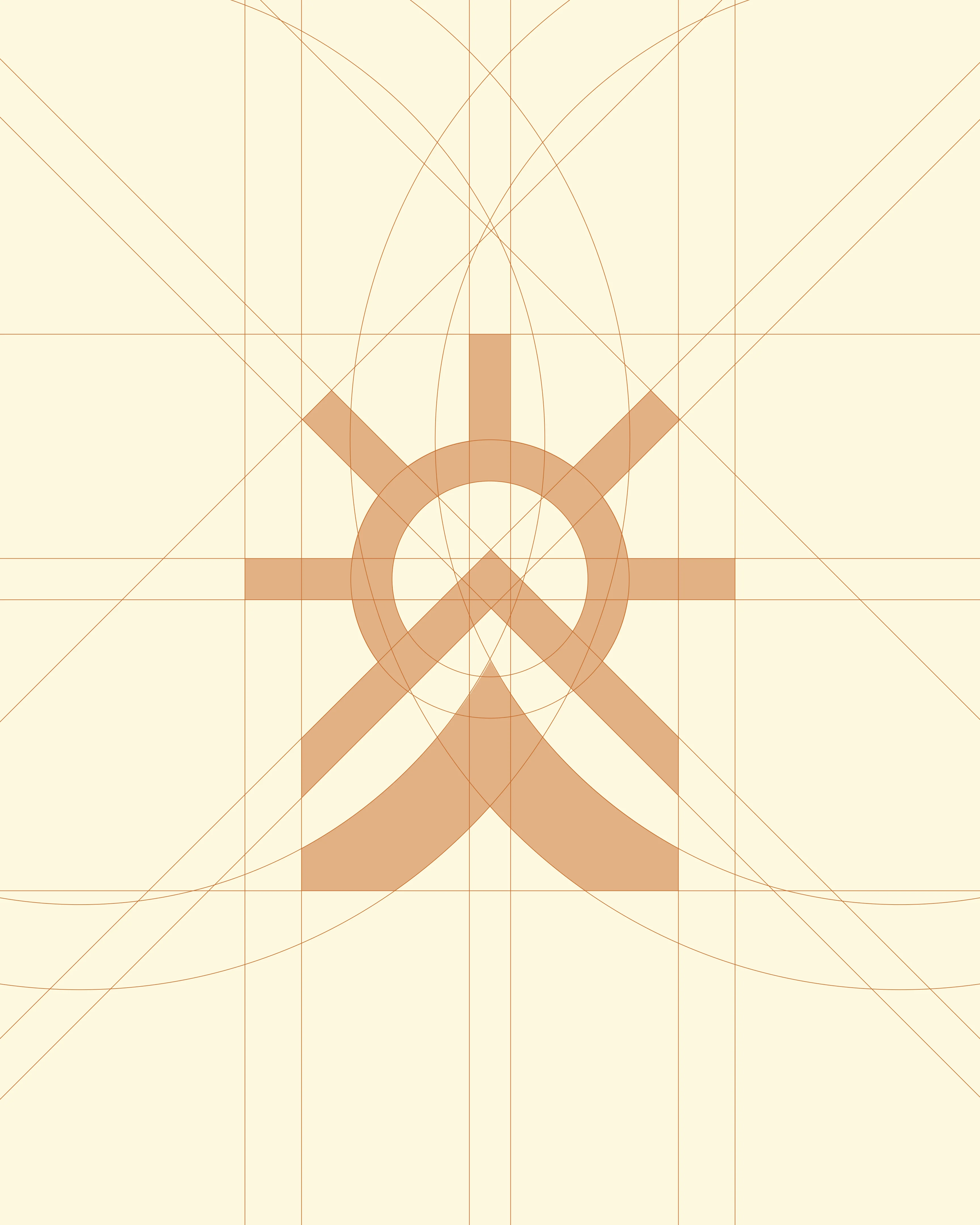
Drawn on circles and straight lines
The mark is built on a grid of circles and diagonals, so the sun's rays, the slope of the mountain and the tent's roof all share the same angles. The strokes have the same weight throughout and soft, rounded ends.
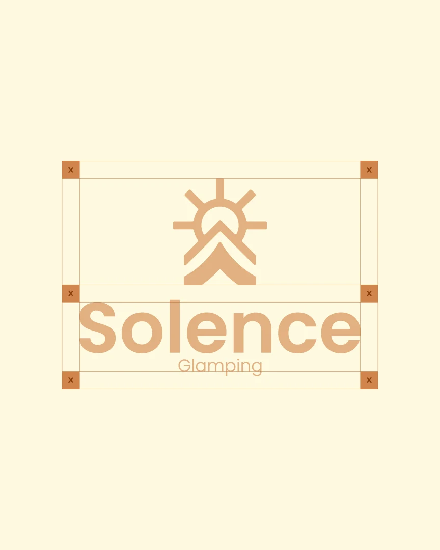
The logo keeps a clear space around it, so nothing crowds it on a sign or a page.
every angle comes from the grid
Upright, side by side, light on dark
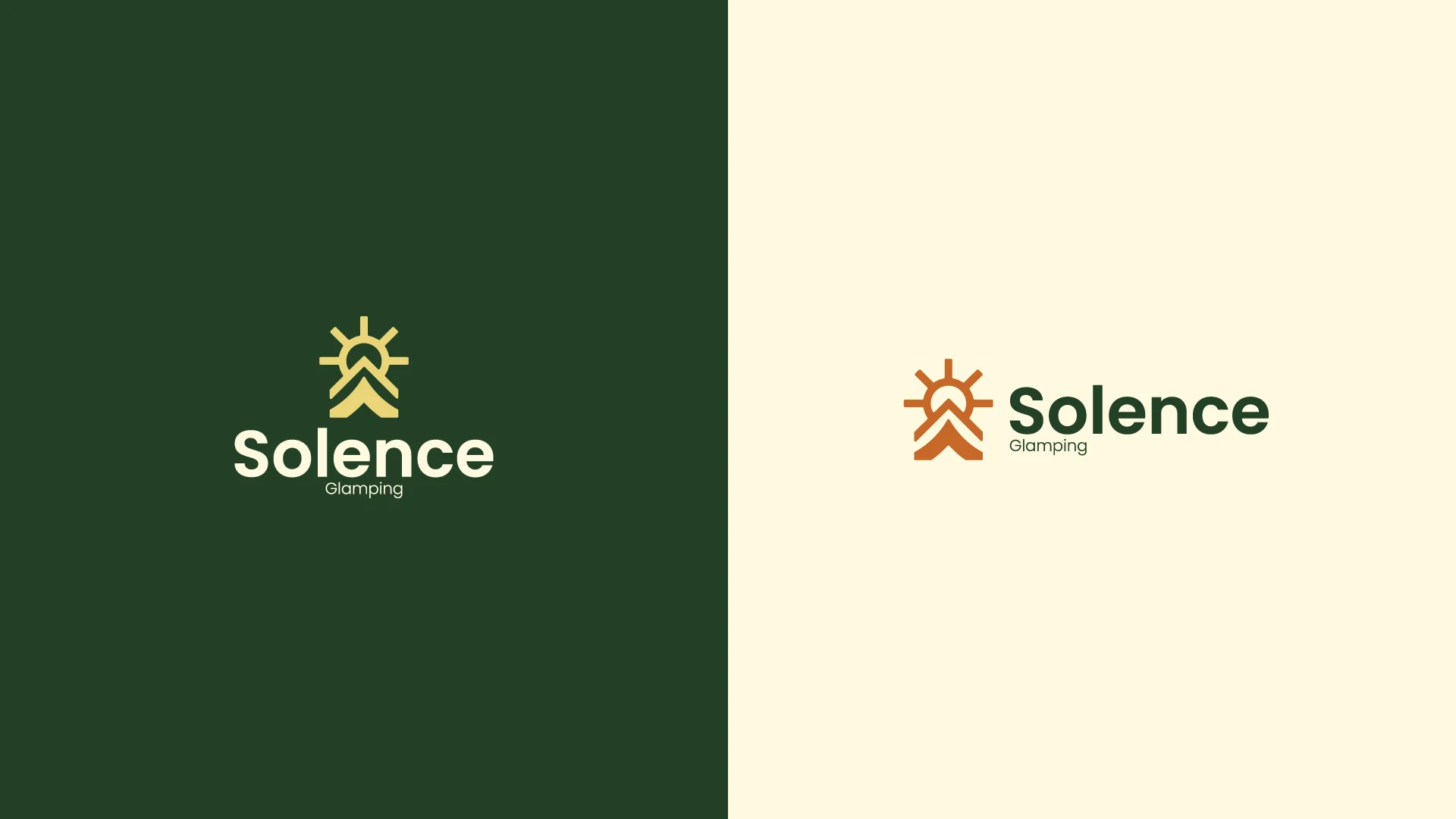
The logo stacks the mark above the name for signs, cards and anything square. For a wide space the mark moves beside the name, and on pine green it turns to gold and parchment.
Colors from the forest, one typeface
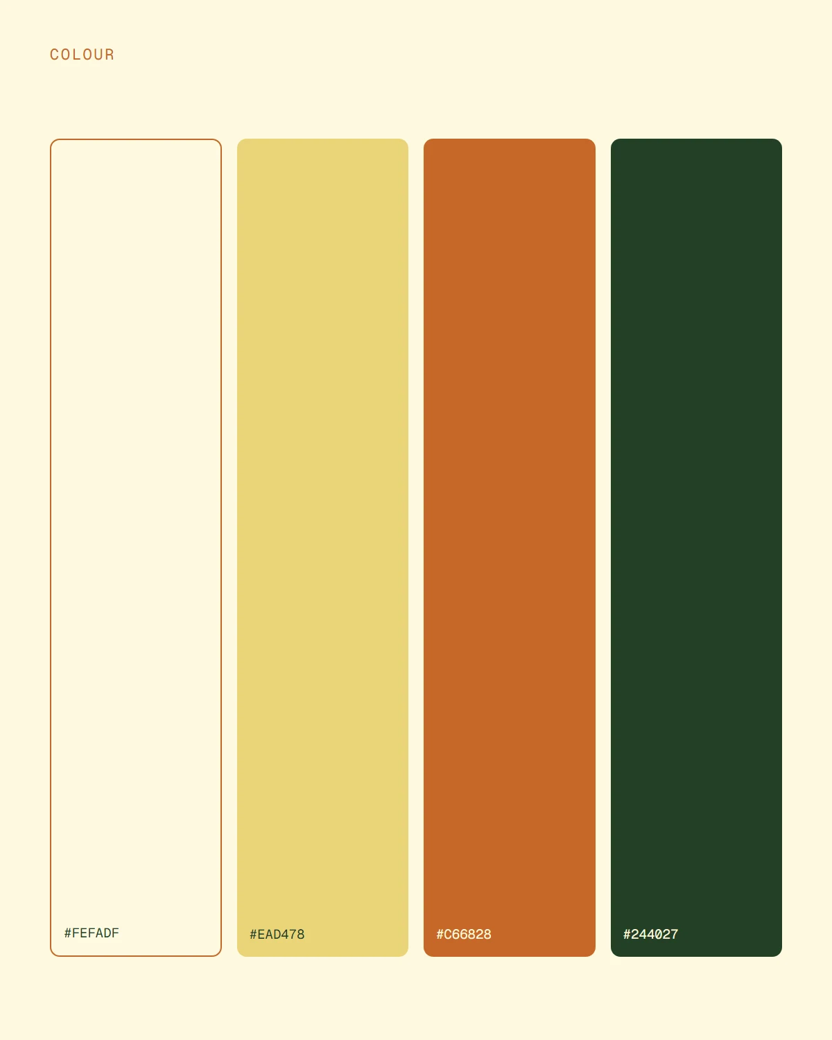
The palette comes from the landscape: a deep pine green, a terracotta like the earth on the paths, a golden yellow for the sun, and a warm parchment that keeps everything soft. Green and parchment carry most of the surfaces; terracotta and gold are the warm accents.
The type is Poppins, a round geometric sans. It matches the rounded ends of the mark, and its full range of weights covers everything from the logo to small print.

The first thing guests see
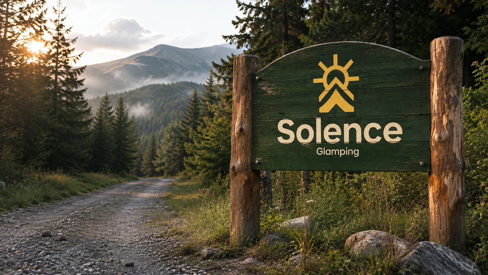
The sign at the end of the road is where the identity meets the place. Pine green boards on two rough posts, the mark in the sun's gold and the name in parchment: the same colors as the forest around it, so it belongs there rather than standing out.
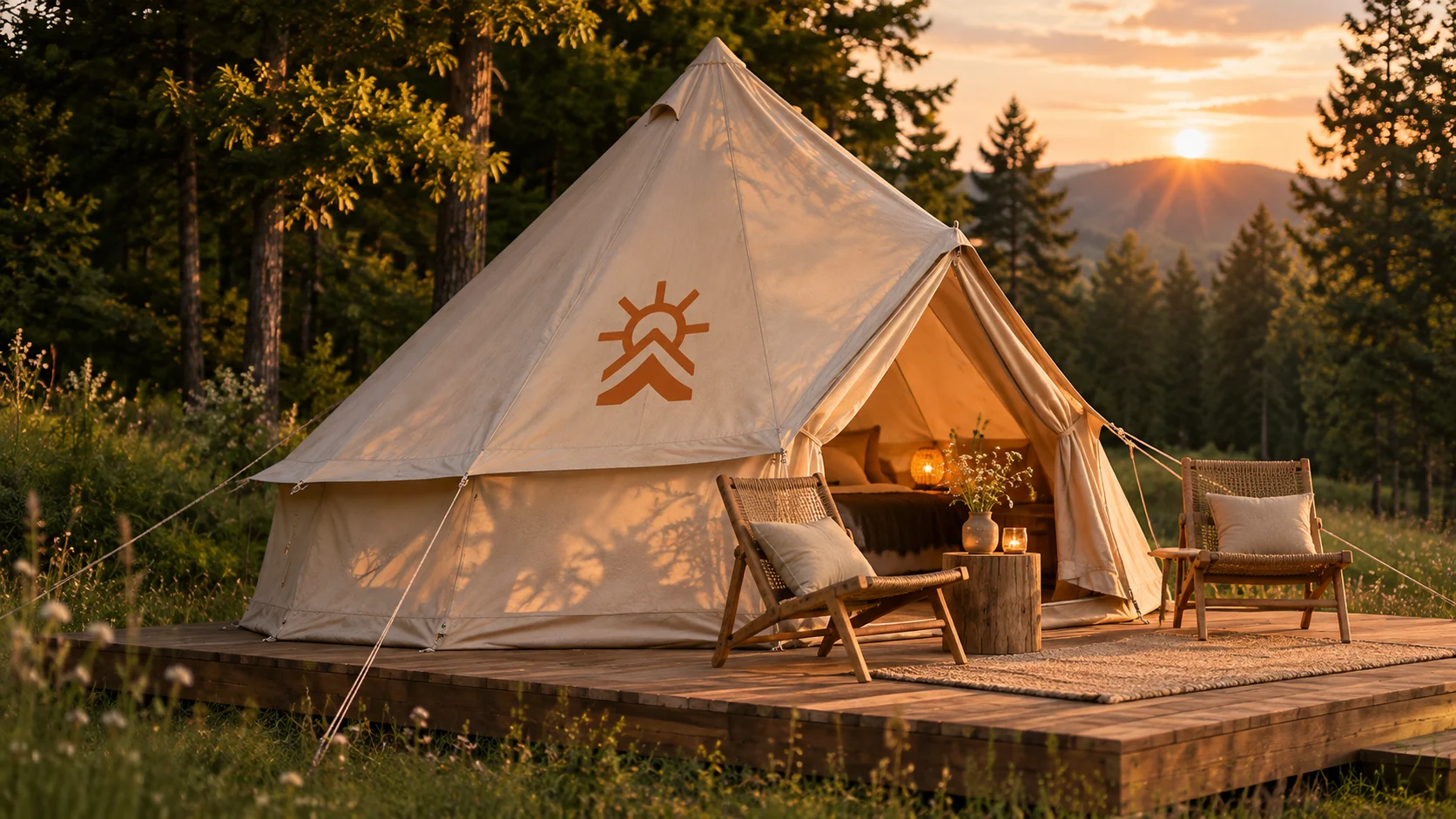
At the tents the name drops away and the mark stands alone, printed on the canvas beside the door.
Finding the way, and the people
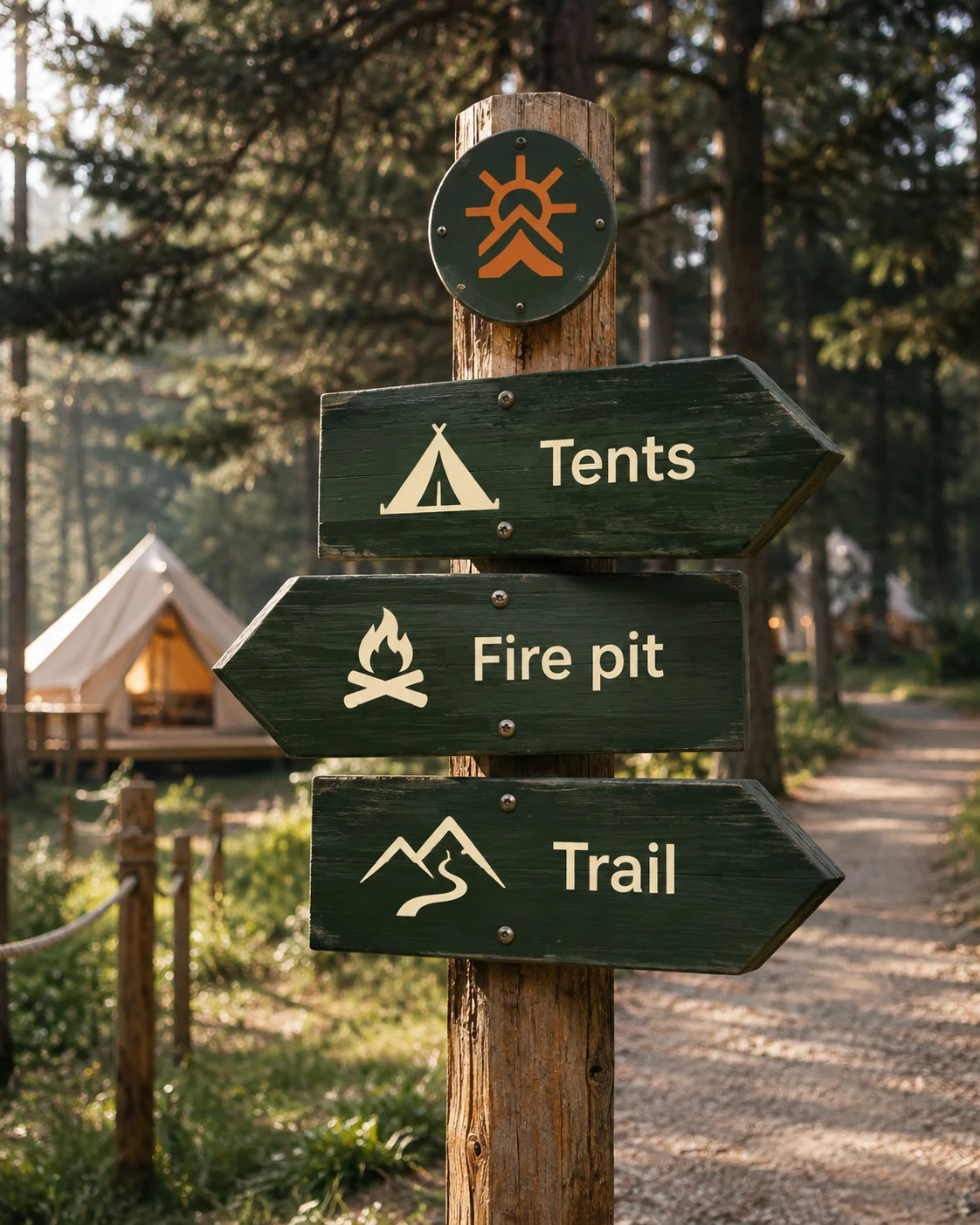
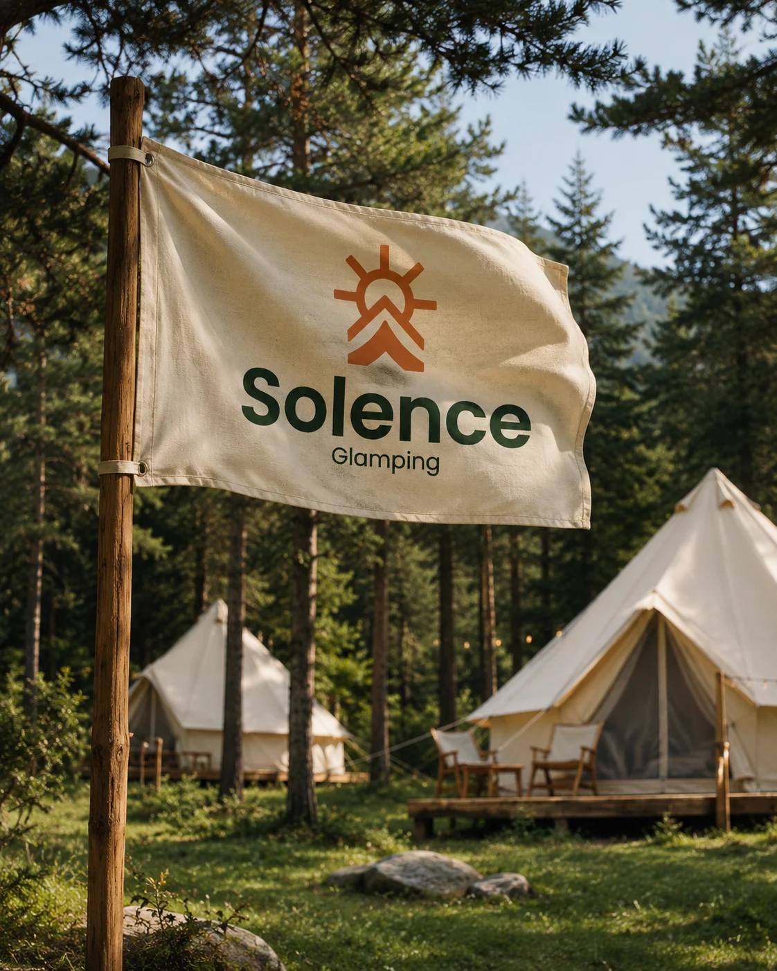
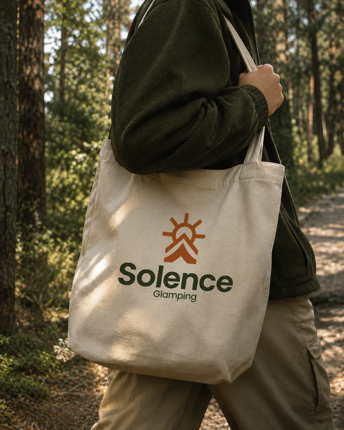
Around the site the same green boards point the way, each with a pictogram drawn in rounded strokes like the mark's. The flag flies over the tents, the staff wear the logo on cream cotton, and guests carry it home on a tote.
the same green as the sign

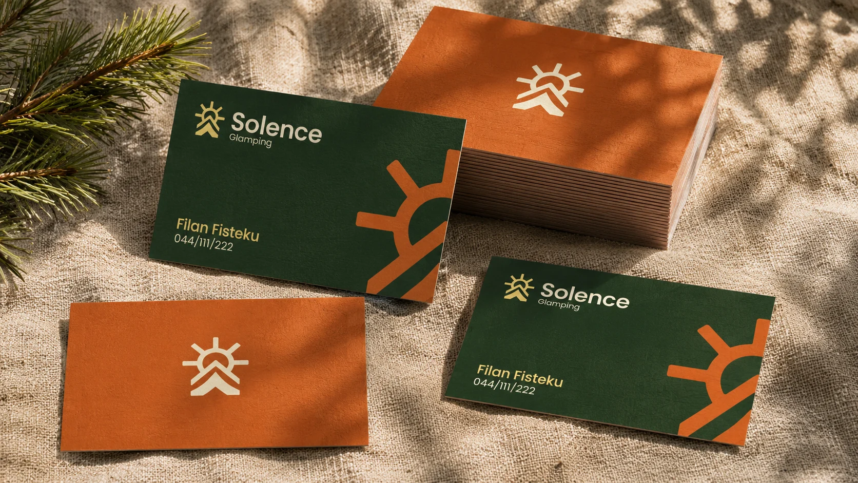
Cards in the brand's two grounds
The business cards use the palette's two strongest colors. The front is pine green, with the logo in a corner and a large terracotta sun rising from the edge; the back is terracotta with the mark alone.
Part of the stay
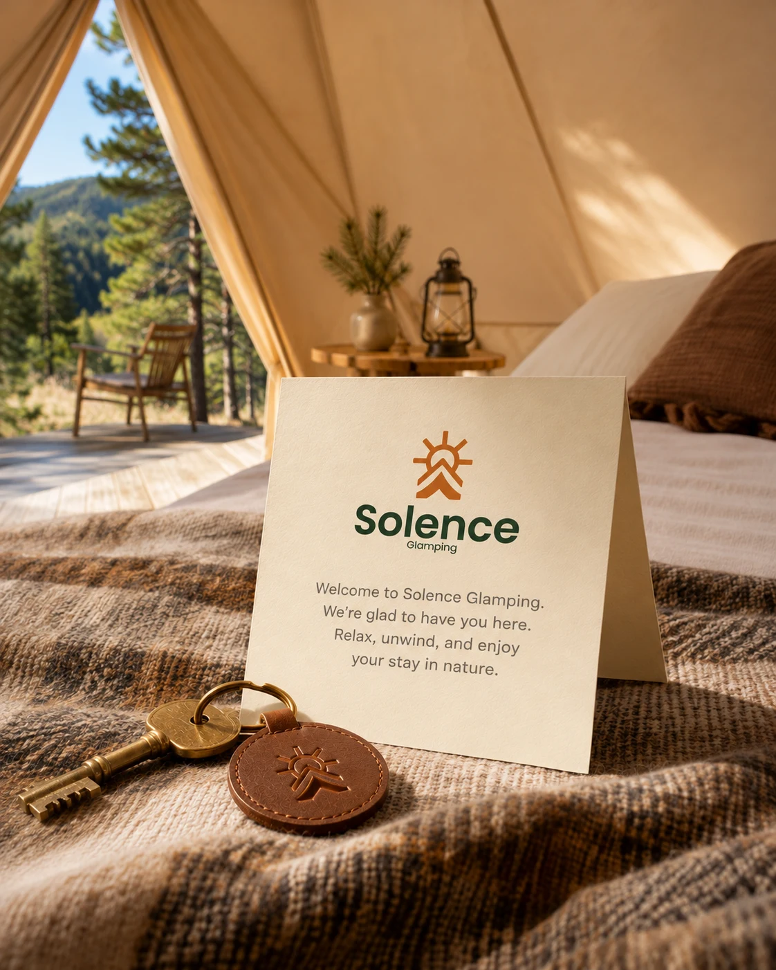
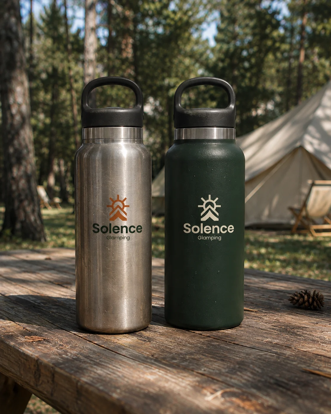
Inside the tent a welcome card waits on the bed with the key. By the fire the mark is on the enamel mug, and on the bottles guests take up the trail. Small things, but they make the stay feel like one place.
a welcome on the bed