Visit Kosovo



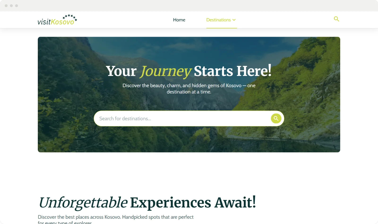
A travel guide to Kosovo, from the old town of Prizren to the peaks of Rugova: where to go, what each place is like and when to visit.
- Year
- 2025
- Role
- Design + development
- Stack
- HTML
- CSS
- JavaScript
- Illustrator
The brief
Kosovo has mountains, monasteries, old towns and lakes within a few hours of each other, but a visitor planning a trip finds them scattered across maps, blogs and booking sites.
Visit Kosovo is a personal project: a travel guide that puts them in one place, with where to go, what each place is like and when to visit. The prices, reviews and tour offers are sample content; the work is the design and the front end.
The outcome
A two-page website, home and destinations, designed and built from scratch and live on Vercel. It runs on plain HTML, CSS and JavaScript, with no framework and nothing to install.
Every destination is written once, in one data file, and the pages build their cards, filters and detail views from it. The same site works on a phone and on a wide screen.
A guide should make you want to go, then show you how to get there.
Every place starts as one entry in a list
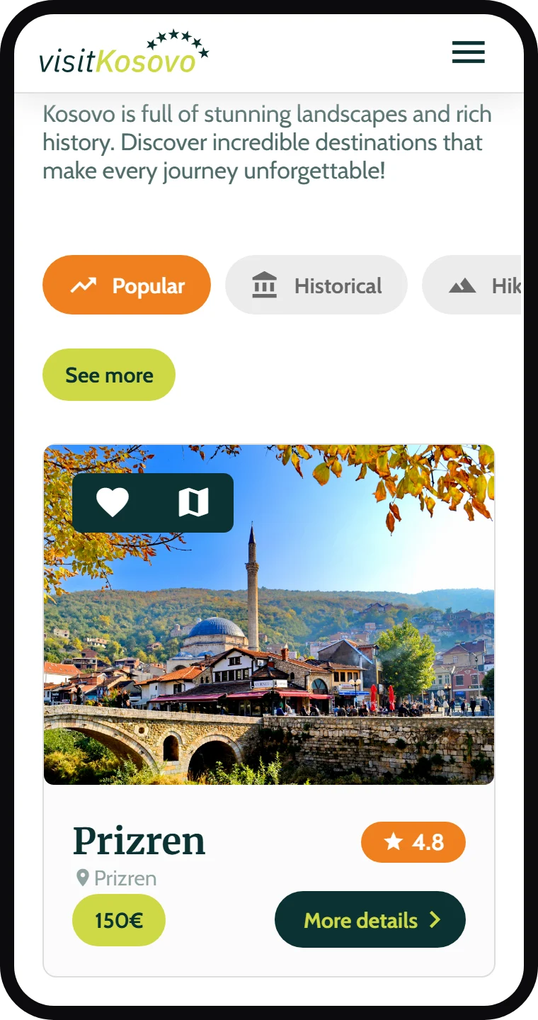
A destination is a few lines of data: its name, photo, rating, town, price and map. The cards, the category filters and the detail views are all built from that list, so adding a place means adding one entry, not another block of HTML.
The filters (popular, historical, hiking, winter, nature) swap the cards in place, without loading a new page. On a phone they sit in one row that scrolls sideways, so the first card is still in view.
five filters, one list
The details open where you are
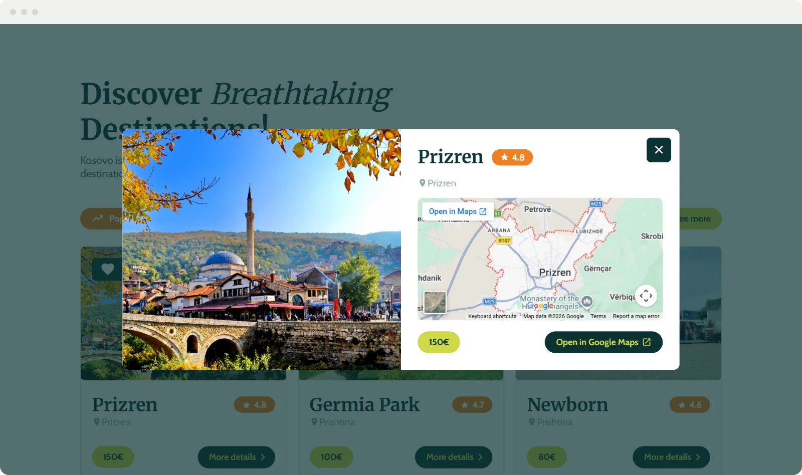
"More details" opens a window over the page with the photo, the rating, a short description and a live map, plus a link that opens the place in Google Maps. Closing it puts you back exactly where you were in the list.
The heart on each card saves a place. The saved list is kept in the browser, so it is still there the next time you visit.
a map, without leaving the page
On a phone, the menu is the whole screen
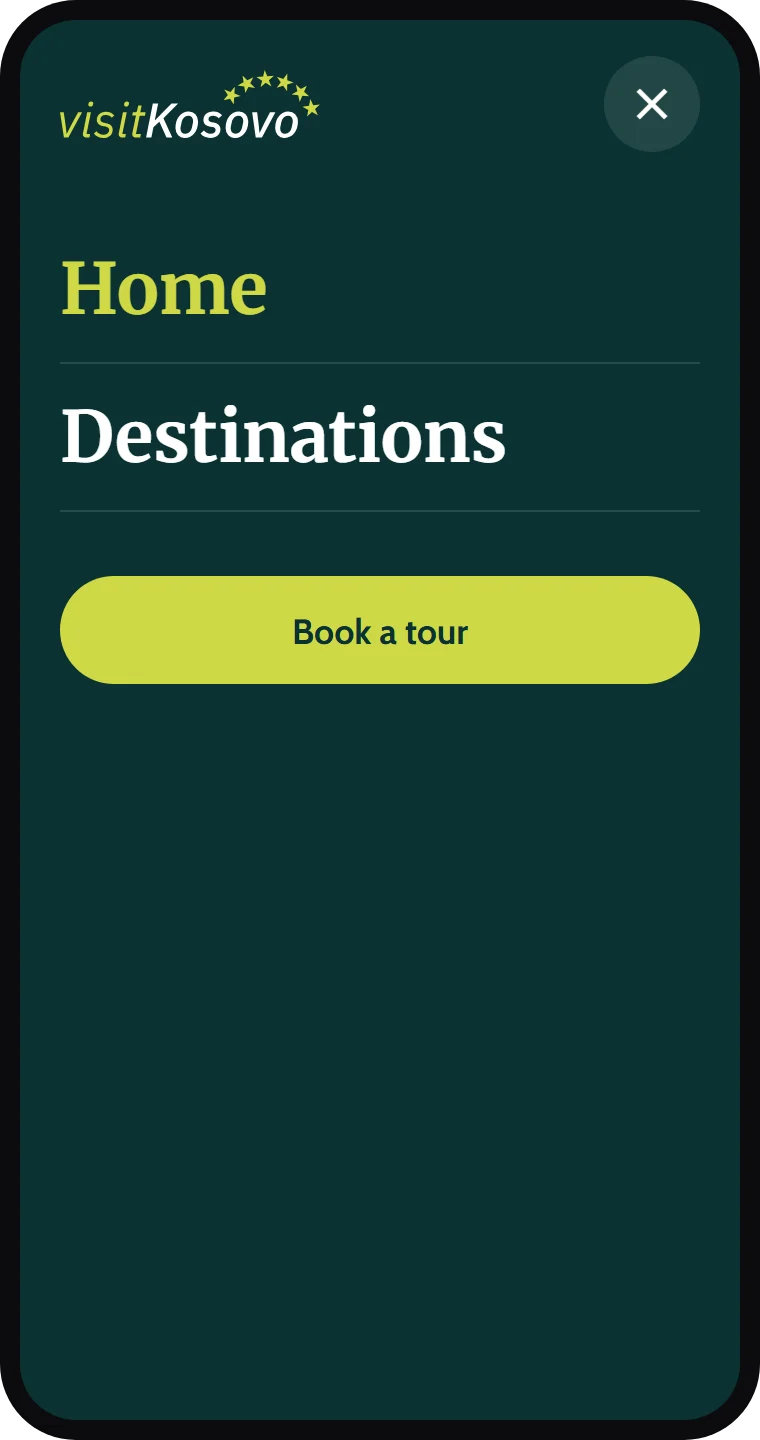
The header keeps only the logo and a menu button. The menu opens over the whole screen with two large links and the main action, Book a tour, and closes with its button or the Escape key.
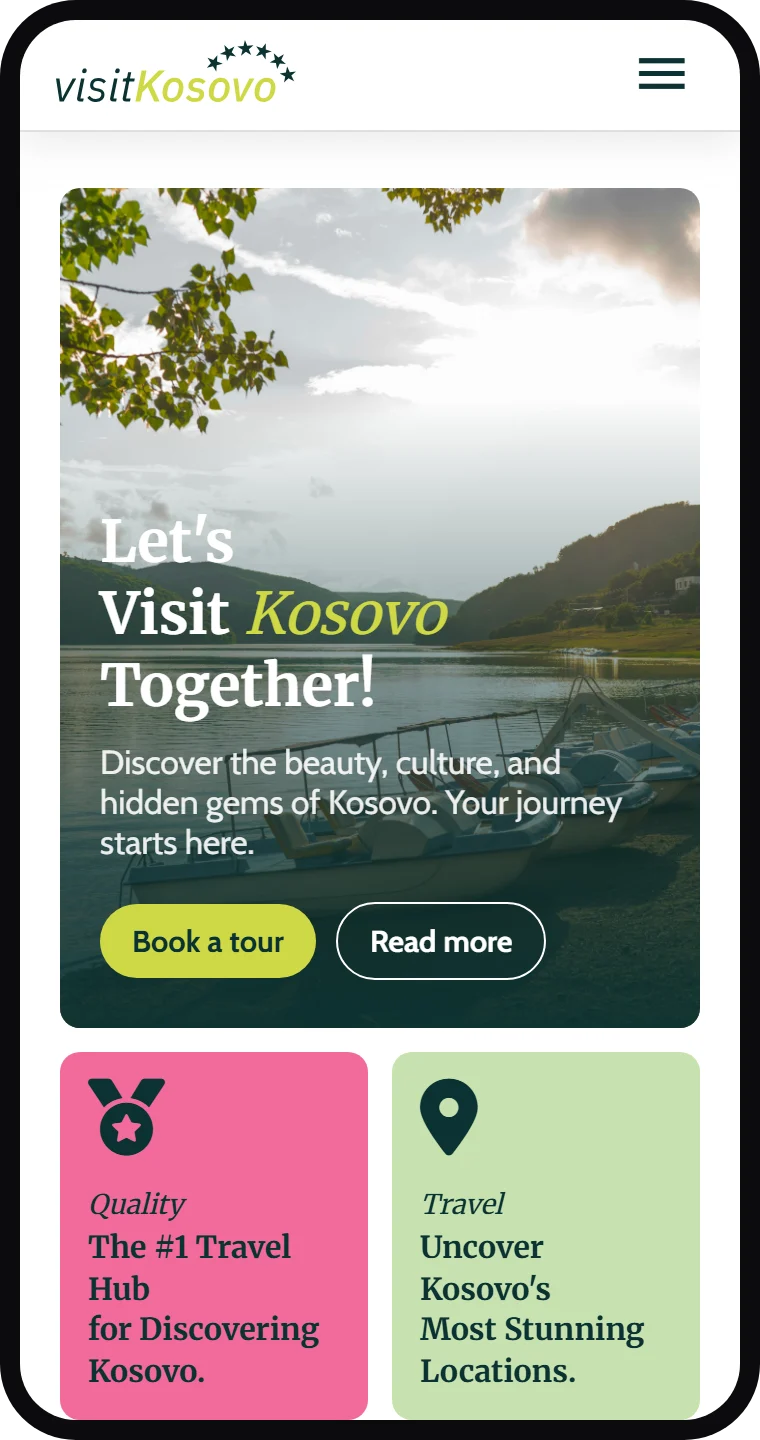
The home page keeps its order on a phone: the welcome first, then the four colored tiles, two by two.
Pine green, lime and a serif
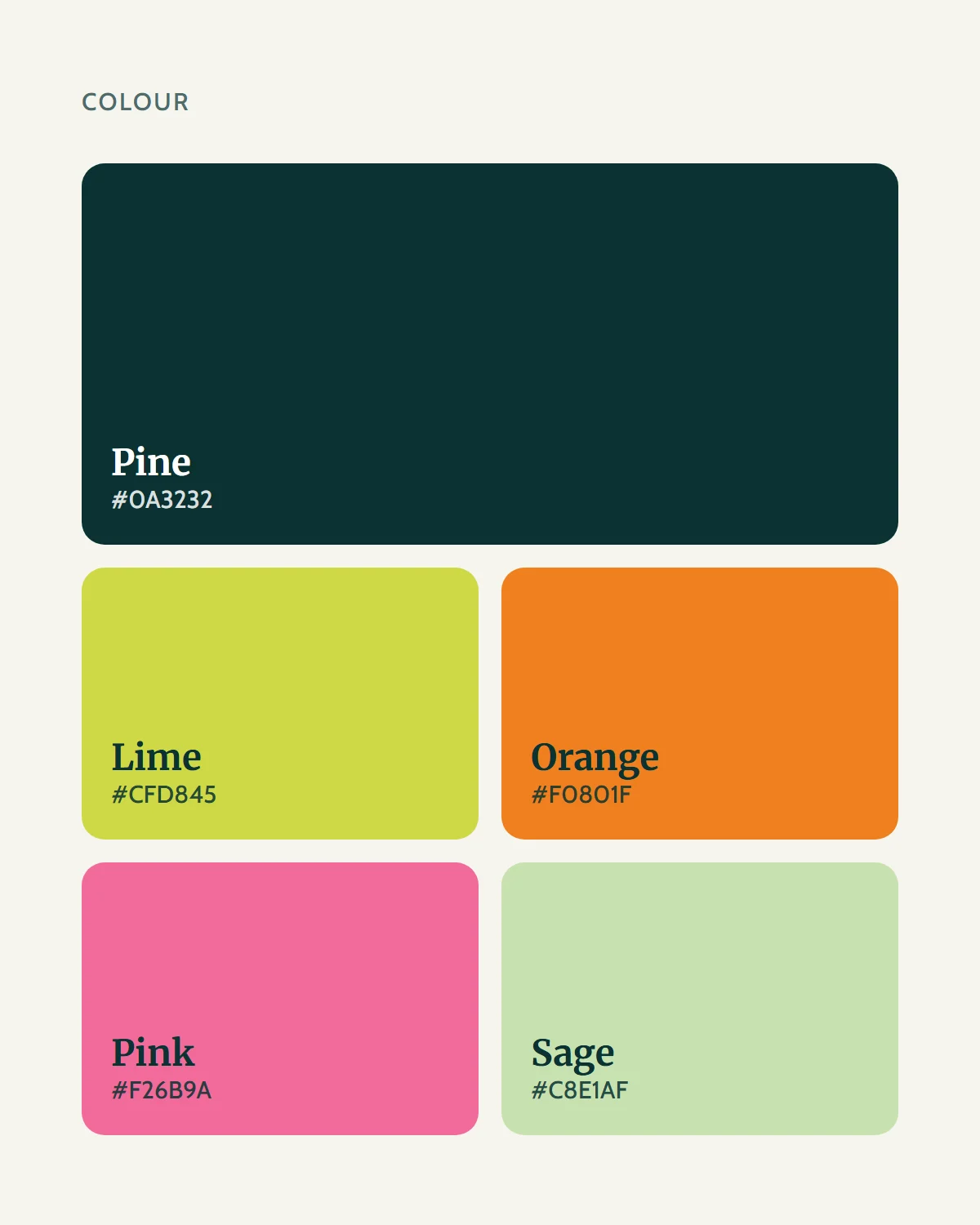
Pine green carries the text and the dark sections, lime marks the main actions, orange marks what is selected, like the active filter and the ratings, and pink and sage fill the tiles.
Headings are set in Merriweather, a serif that feels at home next to old towns and monasteries, with one word in each set in italic. Text and buttons are in Cabin, a plain sans that stays readable at small sizes.

Answers in tabs, not a wall of text
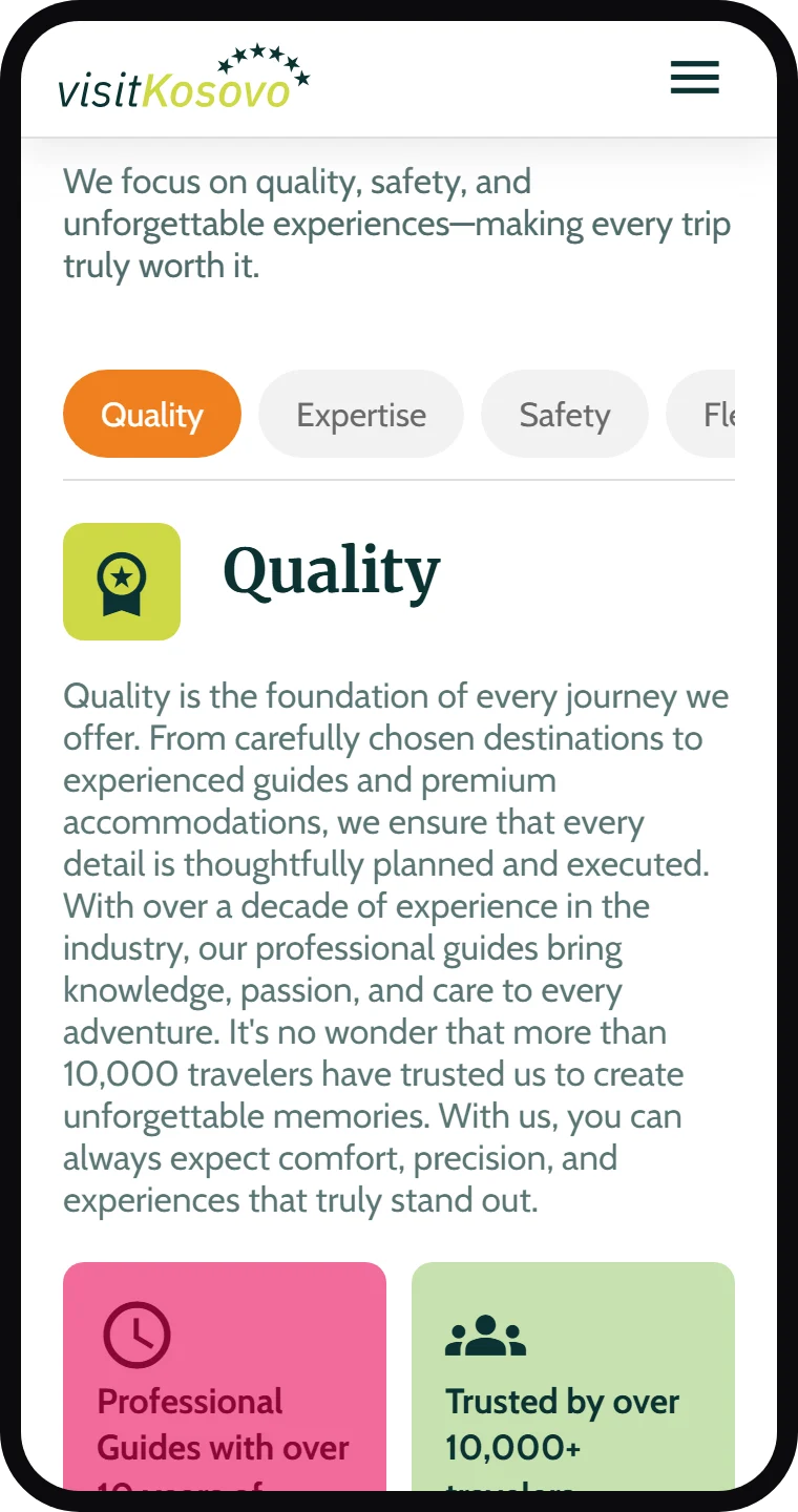
Why choose us has four answers: quality, expertise, safety and flexibility. Each one is a tab that swaps the text and the photos in place, so the section stays about one screen tall on a phone instead of four.
four answers, one screen
A second page for choosing
The Destinations page goes deeper. A search looks through every place by name and town, the five categories open as photo tiles, a city picker shows what there is to see in each city, and a slideshow walks through the six places nobody should miss. It ends with a short guide to each season: the weather, and what it is best for.